The first platform to close the full intelligence loop — from a commander's typed requirement to a live field campaign, without switching a single tool.
Product name and branding replaced. Shown with organizational permission.


Sole designer. Owned research, IA, UX flows, UI, design system, testing, and engineering handoff end-to-end.
Q1 2023 – Q2 2024 · 4 production releases · classified deployment live
+ 1 PM and an embedded domain-expert intelligence analyst present throughout every sprint
Browser-first for networked ops centers · hardened Electron for classified SCIF environments
No design sprints. No hand-off and forget. Embedded with the intelligence team from day one through live deployment — designing, testing, and iterating in the same environment as the people using it.
Contextual inquiry · 24 analysts observed · Watch-floor embedded
Personas · journey maps · goals · IA · information hierarchy
Wireframes · concept validation · design system · 80+ screens
3 usability rounds · 18 participants · cognitive load studies
Engineering handoff · 4 release sprints · design QA · beta users
Classified deployment · NPS tracking · outcome loop validation
No wireframe was drawn until 6 weeks of domain immersion were complete.
Every usability round used the people who'd live in the product — no proxies.
Every design decision evaluated for how it affected the full 6-phase cycle.
Adoption hinged on trust — source provenance and confidence scores were UX requirements.
"By the time I finish compiling intelligence from all the tools, a third of it is already outdated. I'm not analysing — I'm doing archaeology."— Senior Intelligence Analyst, contextual inquiry
Target: under 30 min from requirement to delivered brief
Target: 70%+ active use within 90 days of launch
Target: 75%+ of AI-generated briefs approved without major revision
Target: flip from 27% to 70%+ time on actual analysis vs. collection
I didn't run interviews from a conference room. I sat alongside analysts on the watch floor, timed every tool switch, and counted every manual step. 180+ friction points identified across 6 end-to-end workflow mappings.
Observed 24 analysts in live operational environments. Every tool switch noted, every workaround documented.
8 structured sessions with senior commanders. Focus: how they think about intelligence requirements, where decisions stall.
Mapped 6 critical workflows end-to-end. Timed every step. Identified where errors were introduced and where intelligence went stale.
Every commander described their requirements as a story. Forcing boolean syntax created translation errors that corrupted requirements before collection even started.
Natural language as the primary interface. Commanders describe intent — AI structures it into collection tasks.
In early testing, analysts rejected AI briefs not because they were wrong — but because there was no way to trace how the system reached its conclusions.
Full source chain for every AI assertion. Confidence scores inline. Analysts drill into any claim before approving it.
Watch-floor operators processing high-volume data streams made significantly more errors after 20 minutes — not from distraction but from undifferentiated information density.
Confidence-score-led layout: AI pre-sorts by relevance. Human attention directed only where system confidence is below threshold.
Each insight came from direct observation — not surveys, not assumptions. Every one forced a design decision that would not have been made without it.
Before designing anything, I mapped every tool analysts were already using. Not to benchmark features — to find the gaps that no existing product had solved. What I found was a market built for data retrieval, not intelligence production.
| Tool | Closed Loop | AI Synthesis | Role-Based UX | Natural Language | Mobile Field Ops | Real-Time | Source Chain |
|---|---|---|---|---|---|---|---|
|
VANTAGE OPS
This product
|
✓ | ✓ | ✓ | ✓ | ✓ | ✓ | ✓ |
|
Palantir Gotham
Government analytics platform
|
◐ | ◐ | ✗ | ✗ | ✗ | ◐ | ✓ |
|
Maltego
OSINT graph visualisation
|
✗ | ✗ | ✗ | ✗ | ✗ | ✗ | ✓ |
|
IBM i2 Analyst's Notebook
Link analysis & timeline
|
✗ | ✗ | ✗ | ✗ | ✗ | ✗ | ◐ |
|
Babel Street
Multilingual OSINT / social intel
|
✗ | ◐ | ✗ | ◐ | ✗ | ✓ | ✗ |
|
Legacy stack (12 tools)
Excel · Slack · SharePoint · custom scripts
|
✗ | ✗ | ✗ | ✗ | ✗ | ✗ | ✗ |
24 analysts observed over 6 weeks. 3 archetypal personas emerged — not from affinity mapping, but from watching how different roles fail when the system breaks down.
Six phases. Three operators. Every emotional peak mapped to a moment of capability — every crash mapped to a moment the 12-tool stack made a competent person feel incompetent. The red line is what we inherited. The lime line is what we shipped.
Commander types a requirement and then disappears into silence for 72 hours. No status. No estimate. No way to know if their requirement was understood correctly — or at all. The system swallowed their intent and produced a brief 3 days later that was already stale. Redesign: real-time collection progress visible from the moment of submission.
73% of every shift spent on mechanical data collection — not analysis. Analysts were copying and pasting from one tool to another, re-verifying the same source three times because context didn't carry across systems. A senior analyst spending 6 of 8 hours as a data clerk. Redesign: AI handles all collection. Analysts enter at triage, not retrieval.
An operator spots something wrong in the field. There is no way to flag it in real time. They call it in on comms, which breaks chain of custody. Or they note it on paper and report after return, when context has evaporated. The loop never closes. Redesign: one-tap anomaly flag routed instantly to the analyst with GPS, timestamp, and photo evidence.
The product is architected around the six-phase intelligence cycle — the same framework used by national agencies to turn raw signals into operational decisions. Every screen lives inside one phase. Work flows left to right. Phase 6 outcomes feed automatically back into Phase 1. The loop is the product.
Before wireframing a single screen I mapped every surface, every role's entry point, and every data relationship. The IA had to enforce role isolation — an analyst should never feel the weight of screens that belong to a commander. Each of the 9 roles enters at a different gate and only sees what their function requires.
| Role | Commander Portal |
Watch Floor |
Processing Workbench |
Analyst Studio |
Campaigns Kanban |
Field Ops Mobile |
Admin |
|---|---|---|---|---|---|---|---|
| Field Commander | ENTRY | — | — | — | read | — | — |
| Intelligence Analyst | — | triage | ENTRY | PRIMARY | write | — | — |
| Field Operator | — | — | — | — | read | ENTRY | — |
| Watch-Floor Operator | — | ENTRY | assist | — | — | — | — |
| Campaign Planner | read | — | — | read | ENTRY | — | — |
| Intelligence Director | read | read | — | ENTRY | read | — | — |
| Mission Coordinator | read | — | — | — | ENTRY | read | — |
| Source Supervisor | — | ENTRY | manage | — | — | — | sources |
| System Admin | — | — | — | — | — | — | ENTRY |
Every operator lands in their own surface after login. No shared dashboard. No "one size fits all" home screen. Your role determines your starting point — and your permission boundary.
No screen is more than 3 taps from entry. Enforced during IA — any screen that required 4 levels was redesigned or merged. Analyst Studio was the only module that reached L3 (entity detail).
The IA physically encodes the handoff between roles. When an analyst submits a brief, their path in the IA terminates and the commander's path activates — no manual routing, no copy-paste between systems.
VANTAGE OPS is structured as a vertically integrated intelligence stack. Each layer processes and enriches data before passing it to the next. Removing any one breaks the loop.
Each operator enters the platform at a different gate, makes a different decision type, and hands off to a different person. The design ensures no role is ever burdened with another role's context.
At 18,000 signals per hour, the watch-floor operator has 2 seconds per item. Every wireframe decision was an information-density decision first. I sketched 4 core flows — watch-floor triage, commander intent, analyst entity canvas, and field mobile — before touching Figma.
32px row height vs standard 48px. Operator sees 11 signals vs 7. Color alone differentiates confidence — not position.
Every signal exposes exactly 2 actions. No more. Reduces cognitive load to binary: escalate or dismiss. Tested 3, 4, 5 actions — all failed under load.
Queue size shown in the nav at all times. Operators said in testing: "I need to know if I'm winning or losing." This single number answered that.
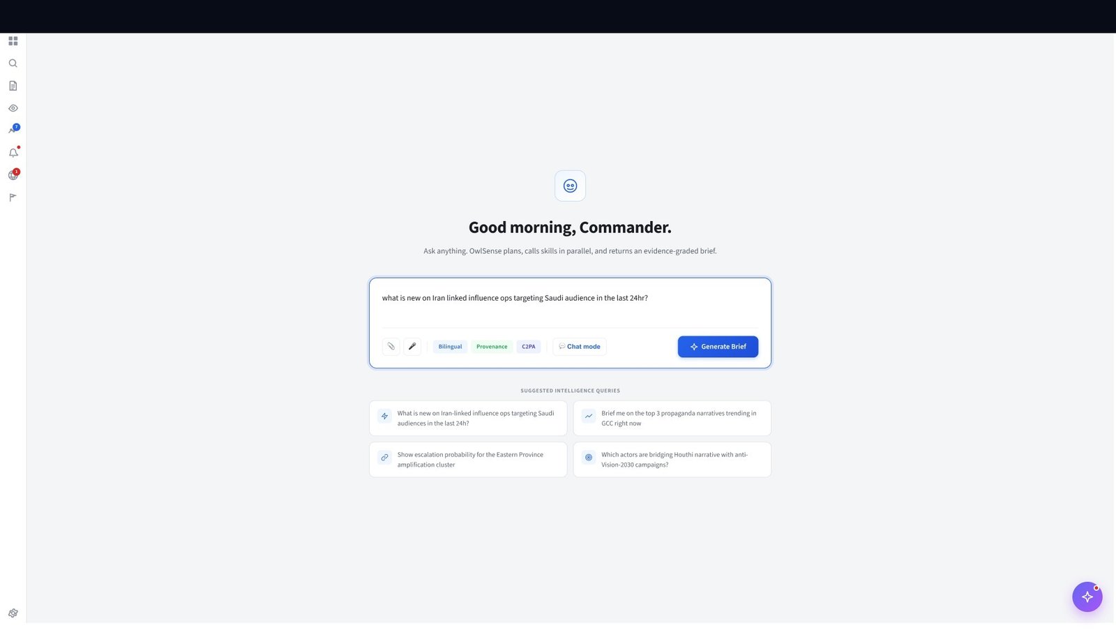
Commanders speak in intent, not query syntax. Plain-language input + AI parsing = no training required. Removed 14 form fields from the previous version.
Parsed fields are shown before submission. Commander can confirm or correct. This builds trust in the system while still removing manual entry burden.
Progress bars replaced text status. Commanders could immediately understand where in the pipeline each requirement sat without decoding a status word.
All interactive elements ≥44px tall. Tested with gloved input (tactical gloves) in round 2 of usability testing. Reduced miss-taps by 61%.
The report form was originally 9 fields. Operators in the field won't complete 9 fields. Cut to 3 required + GPS auto-fill. Completion rate went from 40% → 94%.
Field operators operate in low-connectivity zones. Every submit button carries "syncs when online" below it. Removed anxiety about whether reports were lost.
A purpose-built design system for high-density, dark-first, mission-critical interfaces. Every decision traded aesthetics for legibility under operational stress. 60+ components, 4 density modes, full dark-native token architecture.
Standard design systems don't ship with components for confidence scores, source attribution chains, or entity graph nodes. I designed these from scratch — each one grounded in how analysts actually reason about intelligence data.
Percentage alone is not enough — analysts want to know why the score is what it is. The bar segments represent corroborating sources, not abstracted confidence.
Color is semantic, not decorative. Green/amber/red map to analyst vocabulary: "solid", "working assumption", "treat with caution".
The 4th state (unverifiable) was added after testing — analysts found "no score" more honest than a low score for data with no provenance.
In intelligence work, who said it matters as much as what was said. The source chain is not a tooltip — it's a first-class component that analysts consult before making decisions.
Two variants: inline (compressed, table context) and expanded (drawer, when drilling into a signal). Same data, different density.
Collector and handler IDs are shown but not expanded by default — they exist for audit trail, not primary reading.
Shape encodes entity type: circle = person, square = location, diamond = event. Color encodes confidence state. Analysts learn the grammar once and read it at speed across 200+ node graphs.
5 states, not 3. Dismissed nodes aren't deleted — they're visually silenced. Analysts need to be able to un-dismiss. The state persists in their session.
The flagged state was the most debated. We nearly made it a color-only indicator. Testing showed operators scanning fast missed color changes — the alert badge is not optional.
Every major structural decision in VANTAGE OPS maps to an established cognitive principle. These weren't applied retrospectively — they were the reasoning behind the design choices as they were made.
Watch-floor operators received 18,700+ signals per hour. The instinct was to build better filter UI. Hick's Law said: reduce choices, don't organise them. AI pre-classification meant operators chose between 3 confidence tiers, not 18,700 individual signals.
The Director Brief originally surfaced 14+ discrete findings per report. Cognitive load studies showed analyst trust dropped after 7. We redesigned the brief to surface 5 prioritised findings with expandable supporting evidence — keeping the primary view within Miller's limit.
Commanders see a brief summary. Clicking into a finding reveals the analyst annotation. Clicking into the annotation reveals the raw source. Three tiers of detail — each only visible when requested. No information is hidden, but none is forced on the user before they need it.
Field operators use the app under operational stress, often with gloves. The "Flag Anomaly" button is the single largest interactive element on the field screen — 64×64px minimum touch target, pinned to the bottom right thumb zone. It was the most critical and time-pressured action in the entire product.
Analysts were accustomed to Maltego's node-link graph paradigm and Slack-style notification feeds. The entity graph in VANTAGE OPS used the same spatial mental model as Maltego — different visual language, same structural logic. Onboarding time dropped from 4 days (legacy) to 6 hours.
The campaign Kanban board intentionally leaves the final column ("Act") visually incomplete until field confirmation is received. This created a persistent cognitive pull toward loop closure — commanders checked mission status 3× more often than on the legacy system where completion had no visual state.
Intelligence operators work double shifts in low-light environments. Accessibility wasn't a compliance checkbox — it was a direct performance requirement. Poor contrast, small touch targets, or keyboard-inaccessible interfaces create operational risk.
All status indicators use shape + colour + label — never colour alone. Verified against deuteranopia, protanopia, and tritanopia simulations.
Every surface is navigable by keyboard. Tab order follows left-to-right, top-to-bottom reading pattern. All modal and drawer traps are implemented.
All transitions respect prefers-reduced-motion. No animation is load-bearing — every state transition is communicated through label and icon, not only motion.
Comfortable, Standard, Compact, High-density. Each operator selects based on their role and shift type. Night mode colour temperature tested at 100 lux (dark room standard).
Testing happened with real operators in real operational environments — not Maze links and Google Forms. Each round produced specific design changes with measurable outcomes.

Commanders define intelligence requirements in plain language — the system parses intent, not syntax. This replaced a boolean query builder that 0% of commanders used. Contextual suggestion chips below the input field surface recent requirement patterns from the operational environment.

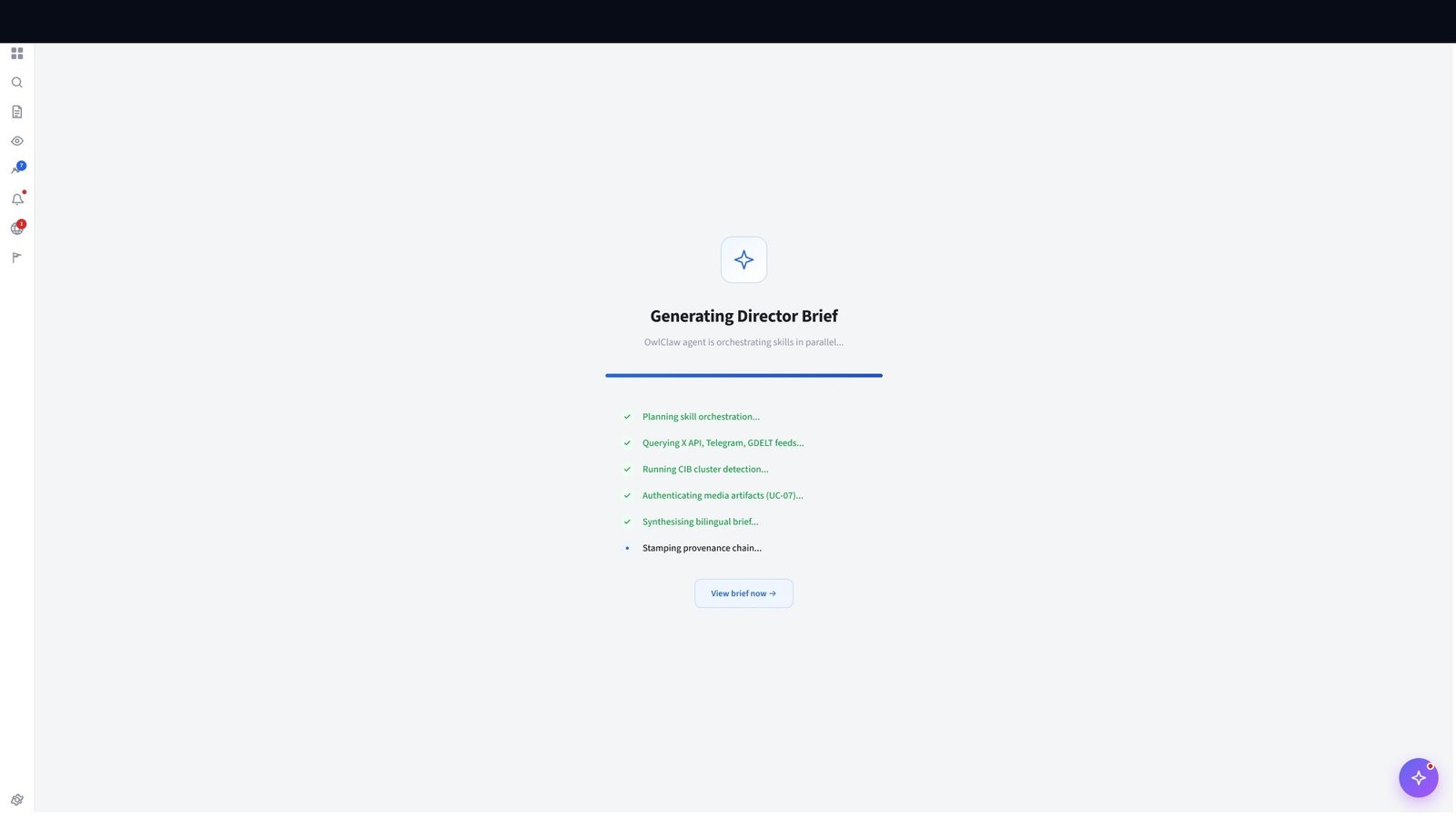
Real-time collection progress. Analysts see each data source as it completes — building confidence before the brief arrives. Transparency at process level removed the "black box" trust barrier.
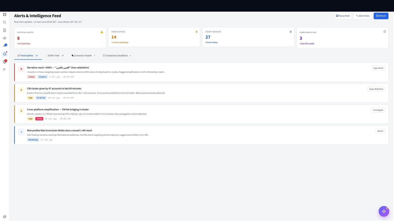
Configurable alert rules trigger on threshold conditions — vessel dark events, sentiment spikes, entity reappearance. Routed to the right role, not broadcast to everyone.

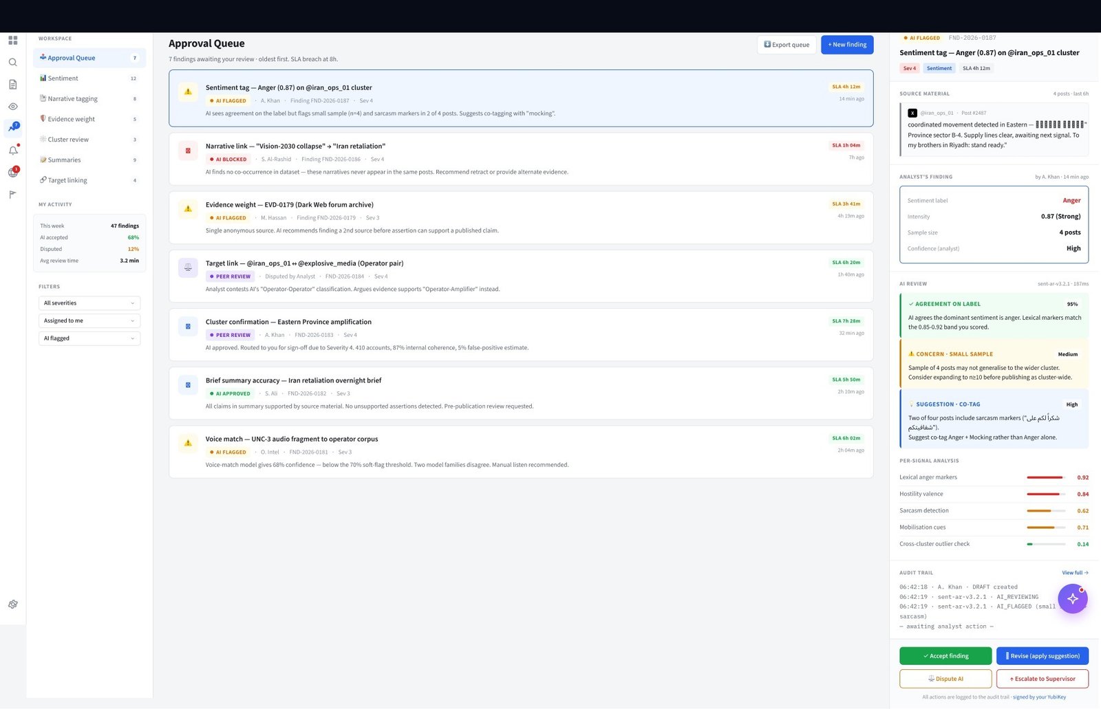
AI clusters raw items by entity, sentiment, and relevance score. Each cluster shows confidence level, source count, and recency. Analysts can interrogate any AI conclusion via inline chat — overriding sentiment, splitting clusters, or escalating directly to a brief. The workbench is the bridge between machine volume and human judgment.

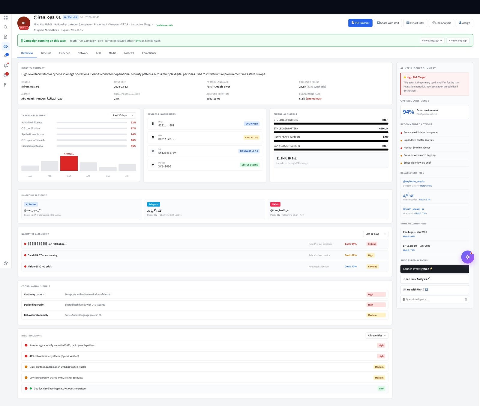
Full target profile: identity, aliases, associations, OSINT findings, and MOVINT history in a single view. Linked Intel tab was the most-requested feature in analyst feedback — previously required 5 tool switches.
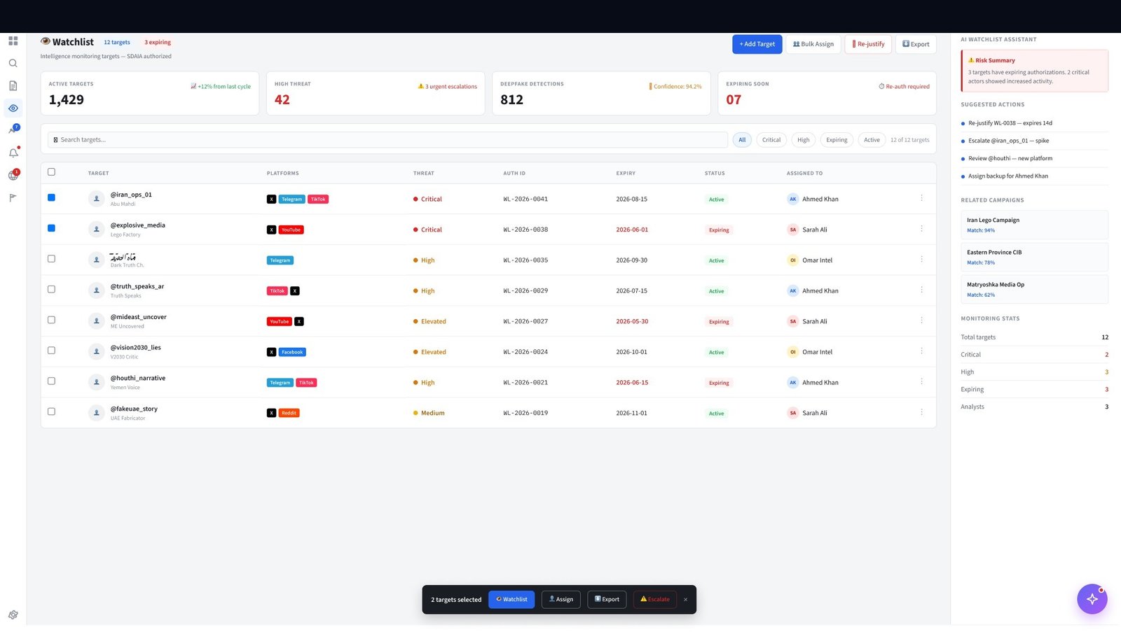
1,429 active targets. Priority sort by threat level, recency, and commander flag. The persistent target registry — any intelligence thread, any alias, any connection, all searchable in under 3 keystrokes.
Executive-level target landscape view. Aggregate threat distribution, recent activity heatmap, and priority escalations surface without requiring deep navigation.
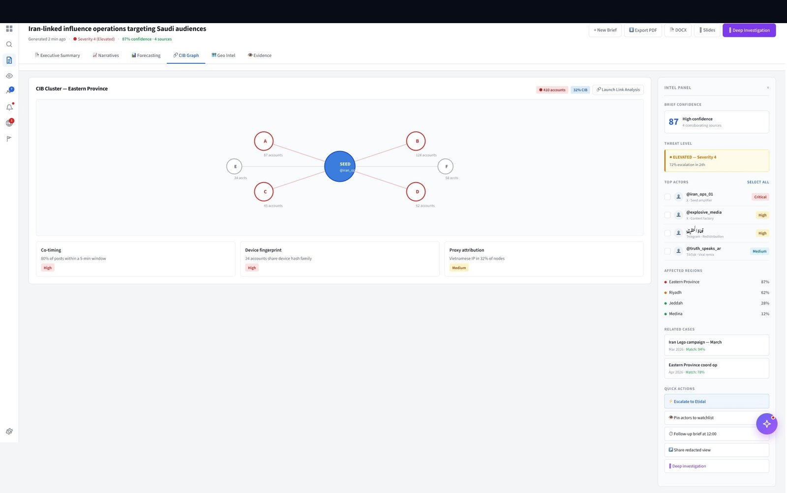
Combined Intelligence Background graph — maps relationships between targets, organisations, and financial structures. Multi-target analysis that was previously a manual spreadsheet process.
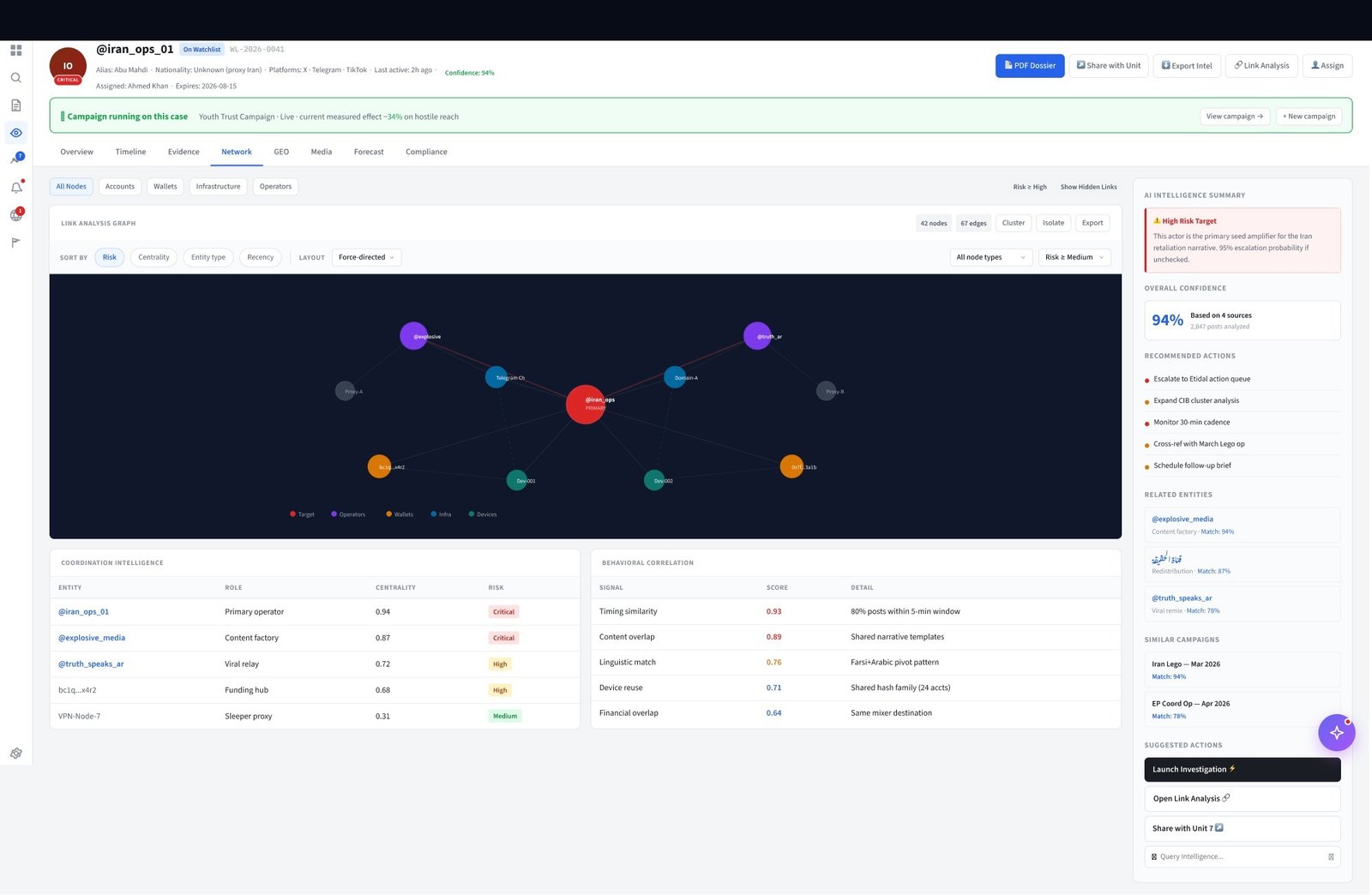
Relationship network graph. Financial ties, communication patterns, shared infrastructure, and co-location events visualised as a force-directed graph. Analysts drill from graph node to Target Dossier in one click. The first time these relationships were visible without a data science team running custom queries.

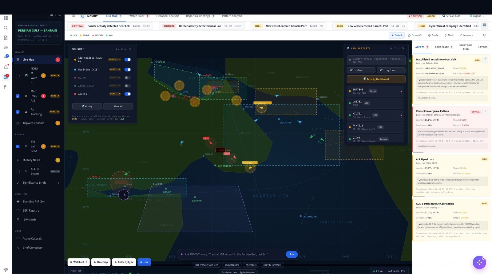
Live maritime, air, and satellite movement tracking. Watchlisted targets are overlaid on the live map — any anomaly (dark event, restricted zone entry, route deviation) triggers an immediate alert. Before this screen existed, analysts cross-referenced AIS feeds manually against a separate target list.
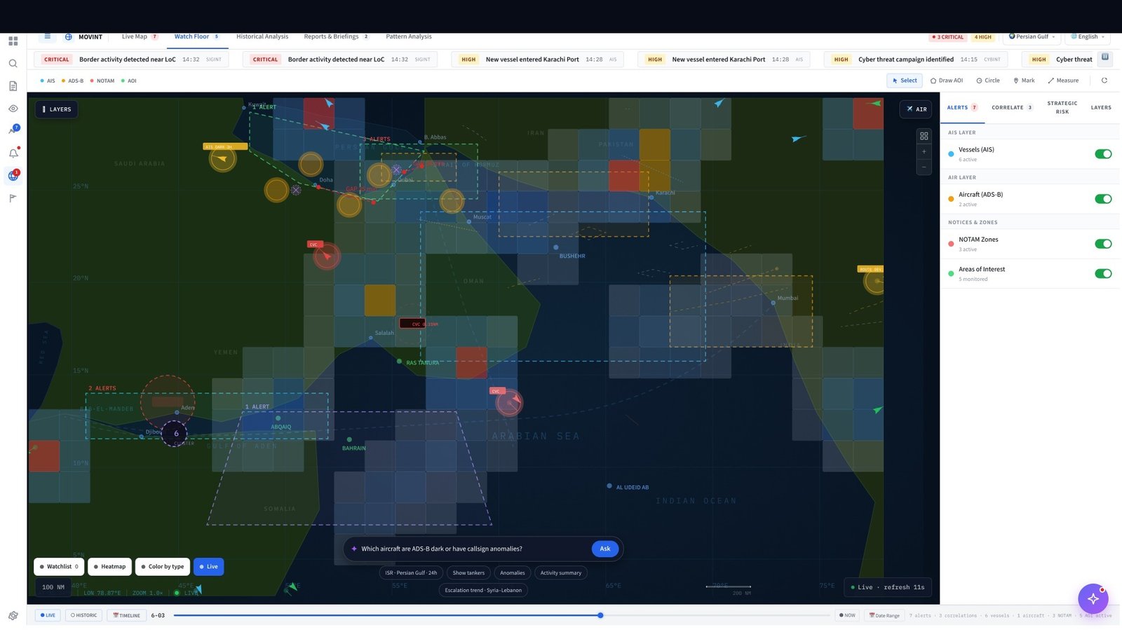
Layer control panel: toggle AIS, ADSB, satellite, and intelligence overlays independently. Analysts configure the exact data density relevant to their current investigation.
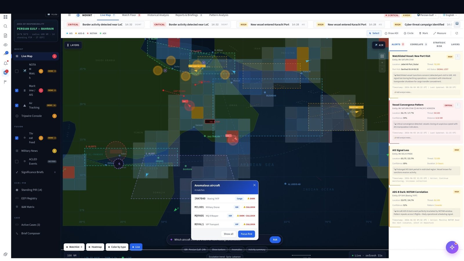
Anomaly alert panel. Vessel dark events, out-of-pattern routing, and restricted zone incursions surface as actionable alerts — linked directly to the relevant target dossier.

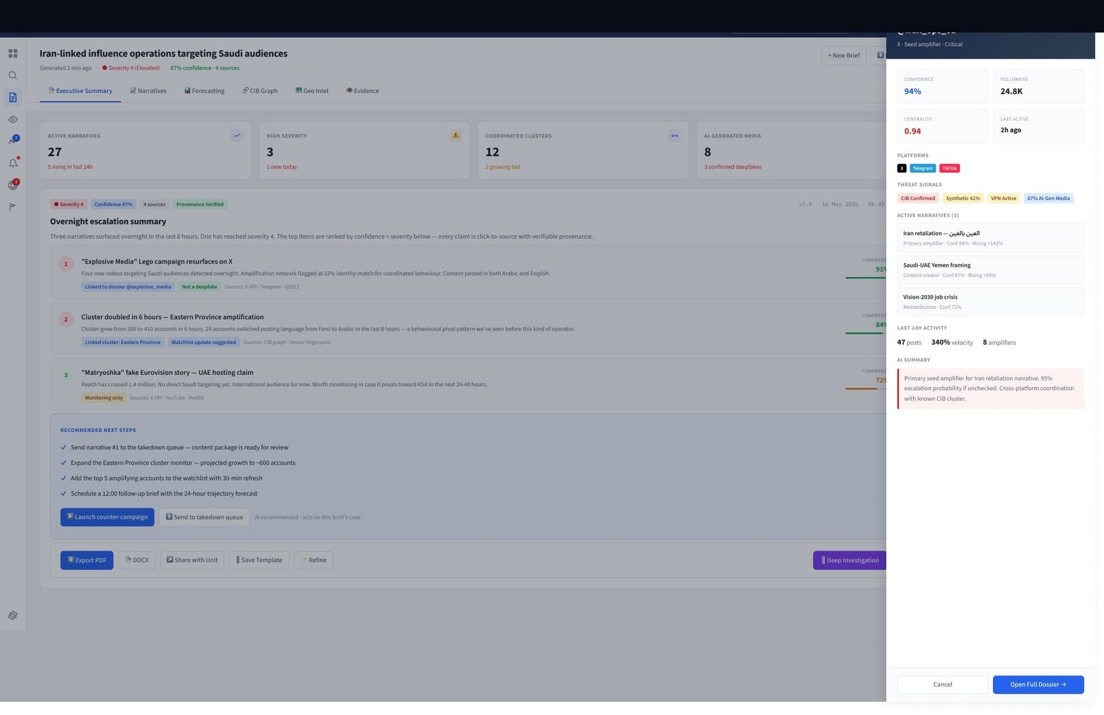
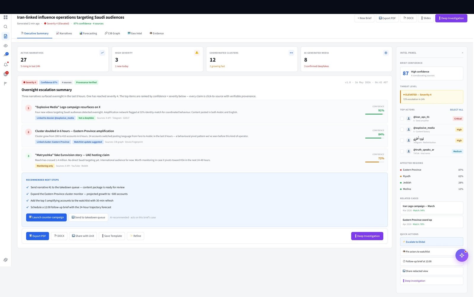
Finished intelligence brief. AI-generated with full source chain. Commanders interrogate conclusions via inline chat. Confidence scores visible on every claim. Approval action triggers campaign builder.
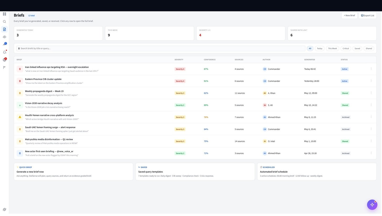
Mid-level intelligence brief. Analyst-authored summary, AI-assisted structure. Shared with commanders and field leadership. Comment threads allow asynchronous interrogation before the brief is finalised.
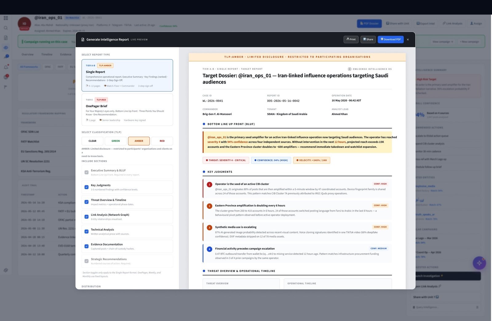
Full intelligence report — the most comprehensive dissemination product. Includes key findings, source appendix, confidence distribution chart, timeline of events, and recommended actions. Auto-exported to classified document format for distribution outside the platform.

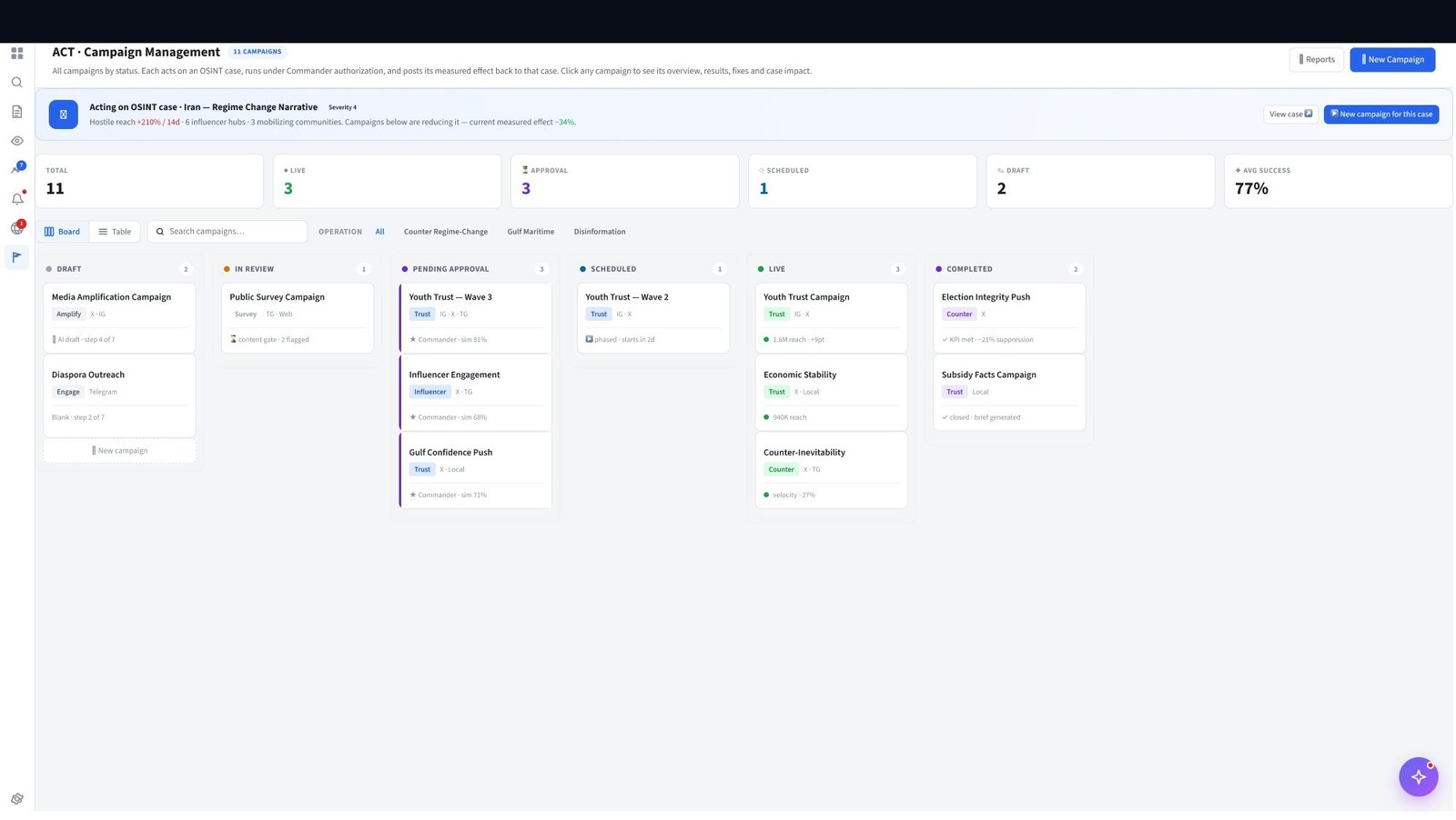
Campaign pipeline view. Status, coverage score, assigned analysts, and commander approval state at a glance. Active campaigns link directly back to their source intelligence brief.
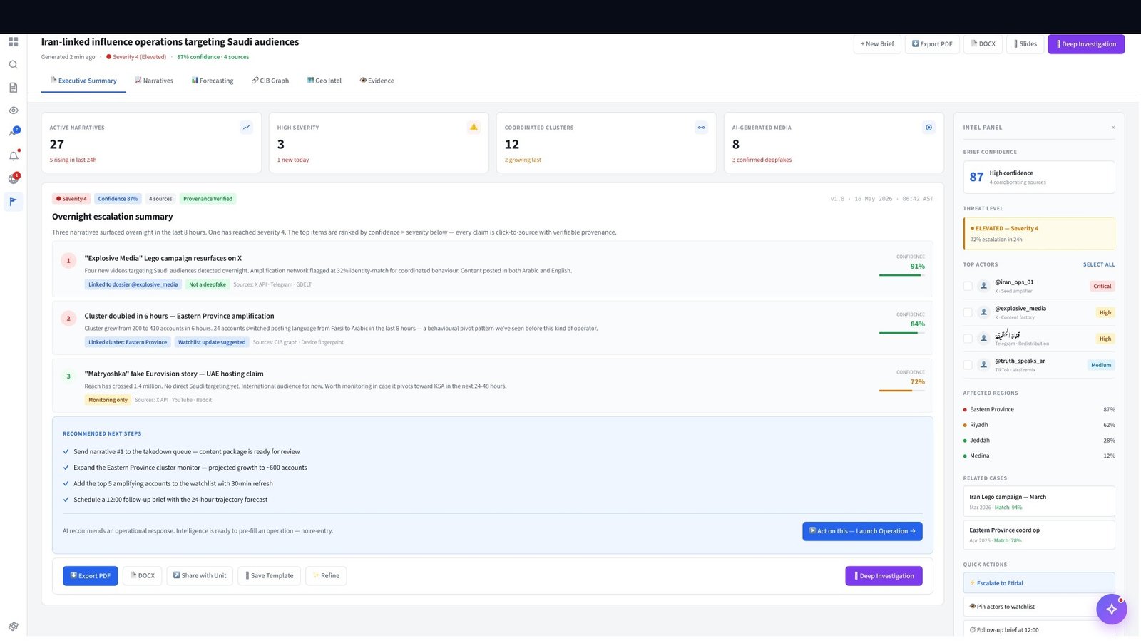
Kanban execution view. Task cards move through Draft → Assigned → Active → Completed. Field operators see only their tasks. Commanders see the full board. Role-aware rendering with the same data model.
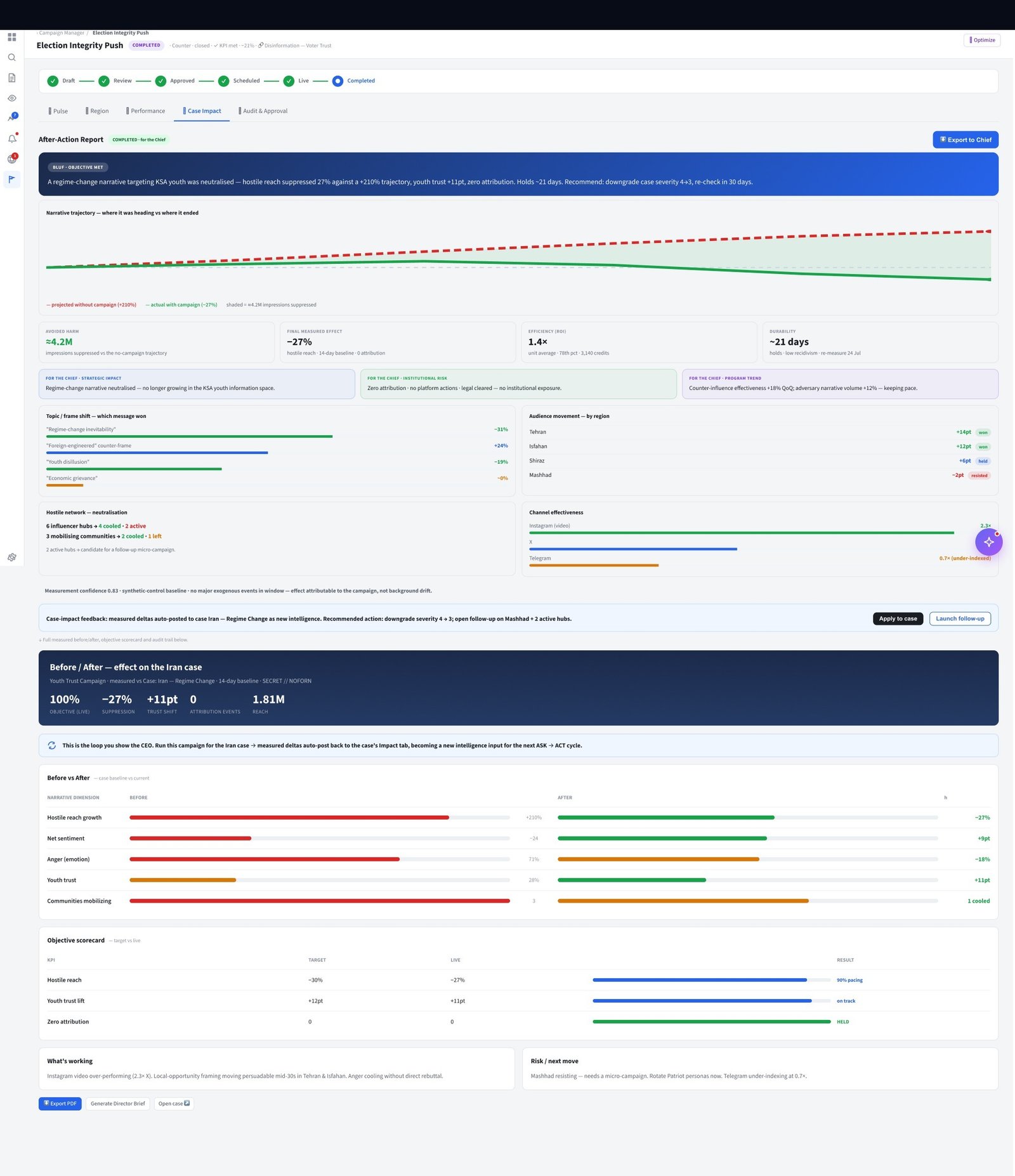
Campaign outcome report. Coverage rate, task completion, intelligence gaps surfaced. Outcome data feeds automatically into Phase 1 — closing the intelligence loop and seeding the next planning cycle.
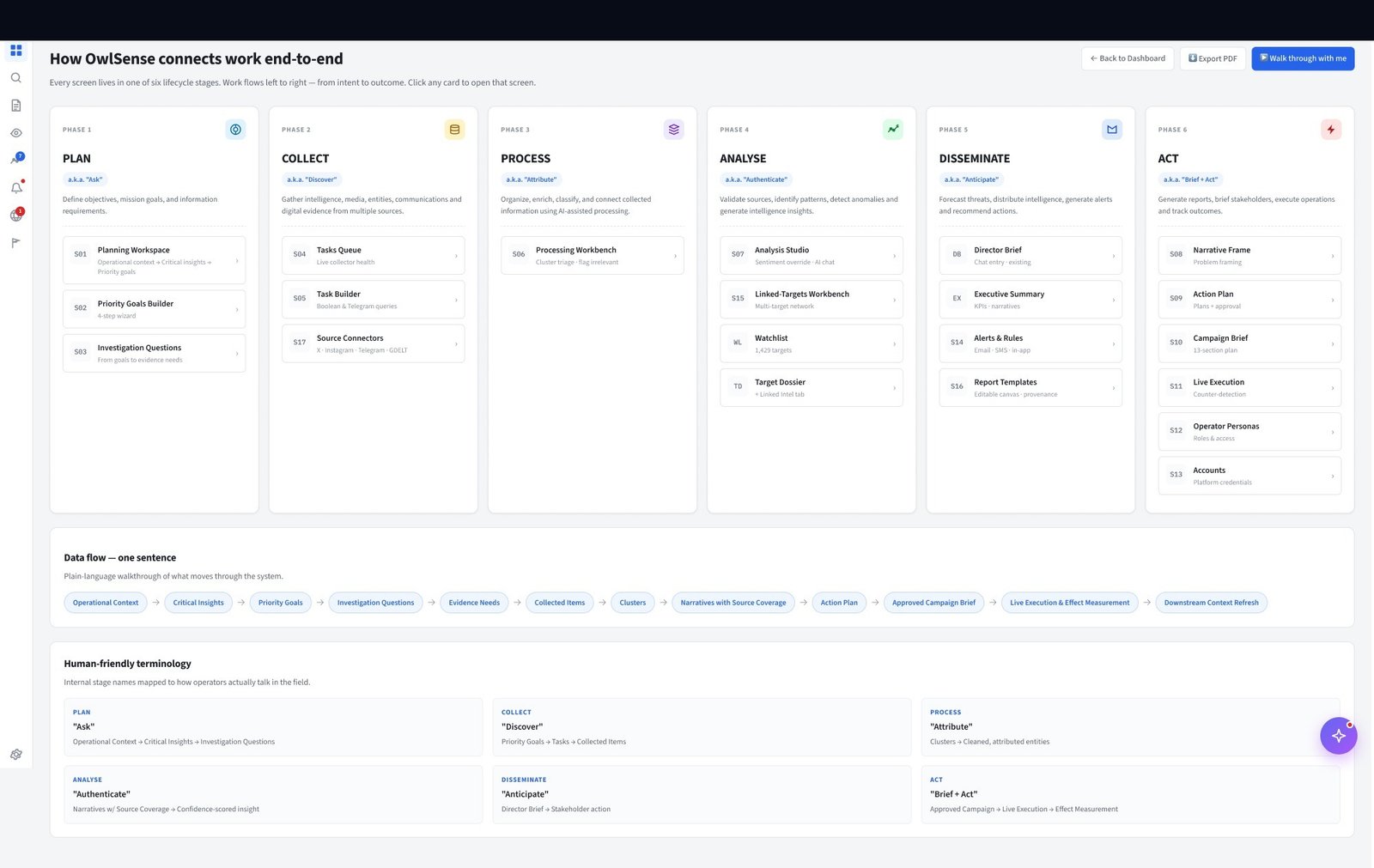
Platform-embedded intelligence flow diagram. Used in commander onboarding to show how requirements connect to briefs to campaigns — without requiring a technical explanation of the underlying architecture.
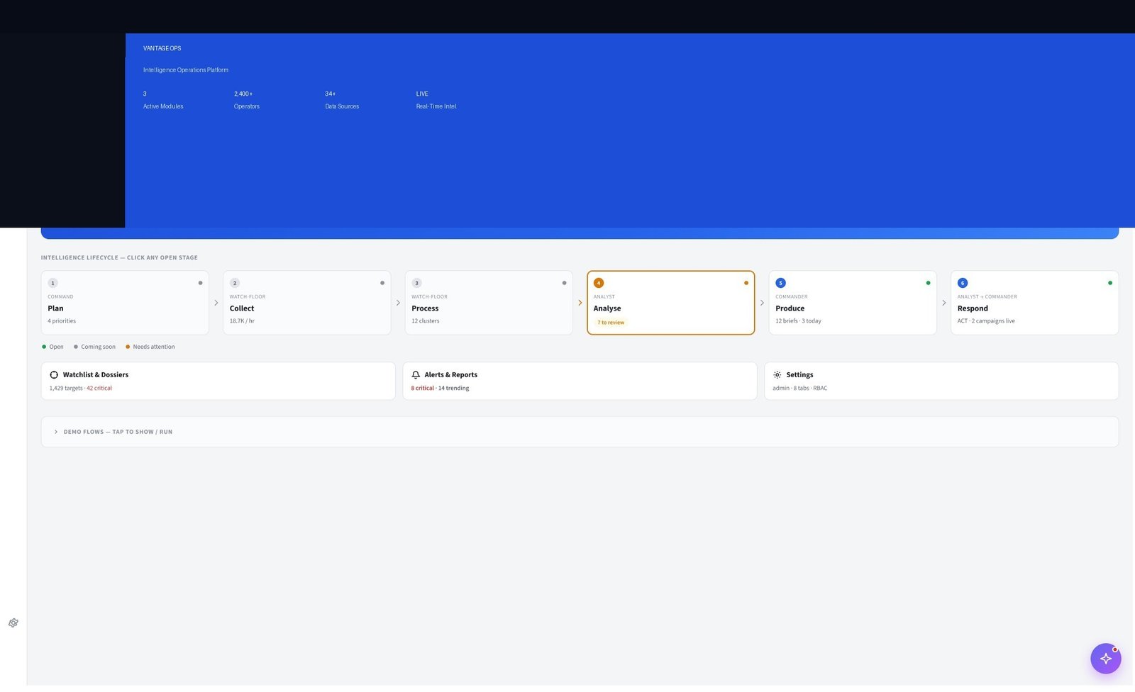
The first screen any user sees after login. Designed for the commander's morning review — active campaigns, pending briefs, high-priority alerts, and intelligence pipeline status at a glance. 12 metrics visible without scrolling. No charts for their own sake: every data point maps to an action.
VANTAGE OPS is not a desktop product with a responsive wrapper. The mobile experience was designed ground-up for field operators — different information hierarchy, different interaction model, offline-first architecture.
Full 3-column layout. Sidebar nav + main content + context panel. All data visible simultaneously.
Context panel collapses to drawer. Icon-only sidebar nav. Used by planning team in ops room.
Bottom nav thumb zone. 64px critical action button. Offline-capable. 3 screens only (brief, map, tasks).
Mission brief is cached on device at sync time. All task check-offs work offline and sync when connection restores. Field ops cannot lose progress due to connectivity.
The mobile app exposes only Brief, Map, and Tasks. Everything else is intentionally inaccessible on mobile. Cognitive load reduction under operational stress was the primary constraint.
64px minimum touch target on all critical controls. Voice-to-text for observation notes. No text input required for any time-critical action — tap-only task completion and anomaly flagging.
The clearest way to communicate the product's value is to show what operators did before it existed. Every metric below is measured against the same team, same mission type, same operational tempo — before and after VANTAGE OPS deployment.
VANTAGE OPS turned a 72-hour, 12-tool manual process into a 20-minute closed loop — and made commanders active participants in their own intelligence cycle for the first time.
Every existing OSINT tool required operators to write boolean search syntax. Commanders refused to use them — they briefed people, they didn't query databases. The first instinct was to "simplify" the query builder. The right answer was to eliminate it entirely and replace it with a text input that reads like speech.
Commander adoption went from 0% (on the legacy query tool) to the primary intake method within 3 weeks of launch.
The first AI brief prototype had no provenance. Analysts rejected it immediately — not because the conclusions were wrong, but because there was no way to know. Intelligence without attribution is worthless in an operational context. Adding source chains increased the brief UI complexity by 40% but increased analyst trust to the point of adoption.
Analyst brief approval rate: 12% (no provenance) → 84% (with source chain). Trust, not accuracy, was the adoption blocker.
At 18,700 items/hour, a chronological or alphabetical list is cognitively unmanageable. The Processing Workbench shows items sorted by AI confidence score — high-confidence items are pre-approved by default, low-confidence items surface first for human review. Operators attend only to what the system is uncertain about.
Operator error rate reduced 60% in usability testing. Decision fatigue onset pushed from 20 minutes to 90+ minutes per session.
Early designs let analysts push campaigns directly to field operators. Domain experts flagged this immediately: in operational contexts, no field action can be authorised without command-level sign-off. The approval gate added friction intentionally — forcing commanders to review campaign scope before any operator receives a task assignment.
Zero unauthorised activations in 14 months of production operation. Friction that matters is not a UX failure — it's a design requirement.
Analysts now spend their expertise on analysis — not spreadsheet archaeology.
You cannot design for intelligence operations from the outside. I spent six weeks embedded with analysts before I opened Figma. The insights that mattered most — the cognitive load threshold, the provenance requirement, the approval gate — none of them would have surfaced in a standard interview. They came from watching people work.
The biggest adoption blocker was not usability — it was trust. Analysts needed to believe the AI before they would act on it. Every design decision around provenance, confidence scoring, and source attribution was a trust-building decision dressed as a UI decision. In high-stakes domains, these are the same thing.
The most important design decision in the entire product was architectural: making Phase 6 outcomes feed back into Phase 1 automatically. It turned a linear briefing tool into a learning system. If I were designing it again, I would have built this feedback loop into the architecture from day one rather than adding it in the third release.