The AI Ecommerce Marketplace, built B2B-first.
An AI-powered shopping app where 12,400 brands sell, and a B2B operations suite where they scale — one ecommerce platform, two sides.
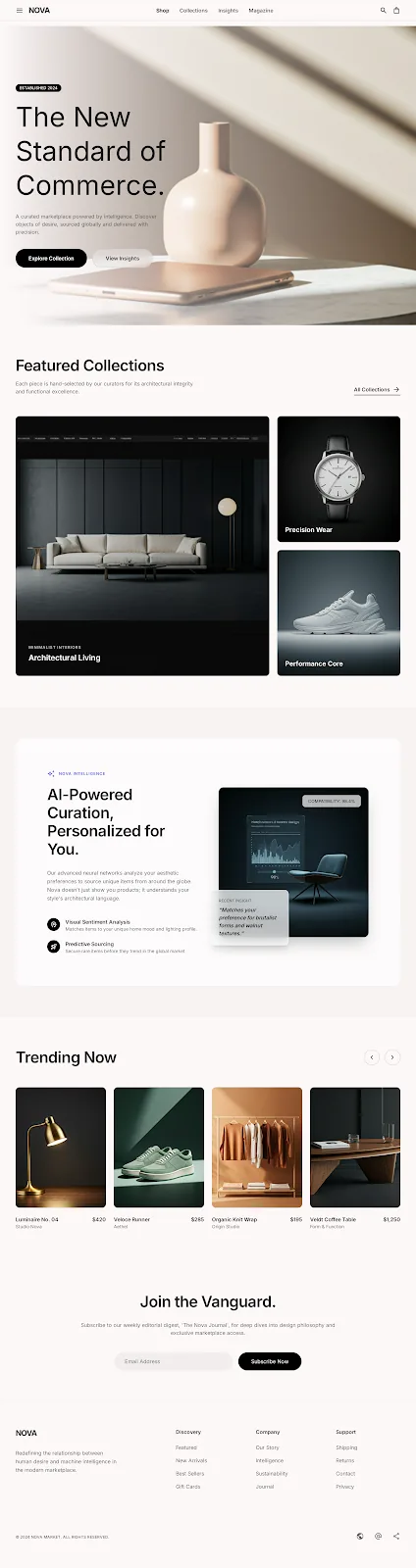
One record carries the whole journey.
A buyer's first tap and a seller's next payout live on the same rail. Six moves — discovery to re-engagement — that never leave the platform, each one feeding the AI that powers the next.
Discover
Style-DNA in 40s seeds a curated home — one object per viewport.
Curate
For You arrives with a match % and a reason — trust before the tap.
Decide
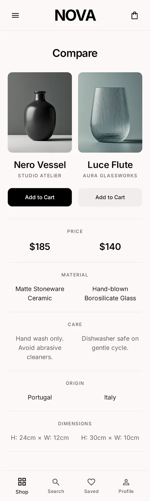
Editorial PDP, save or price-drop alert — no pressure, no grid.
Checkout
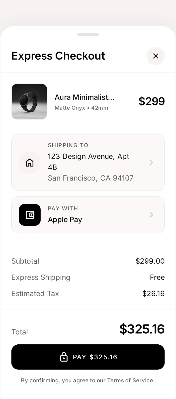
One sheet: address, pay, total — completion 61%→78%.
Track
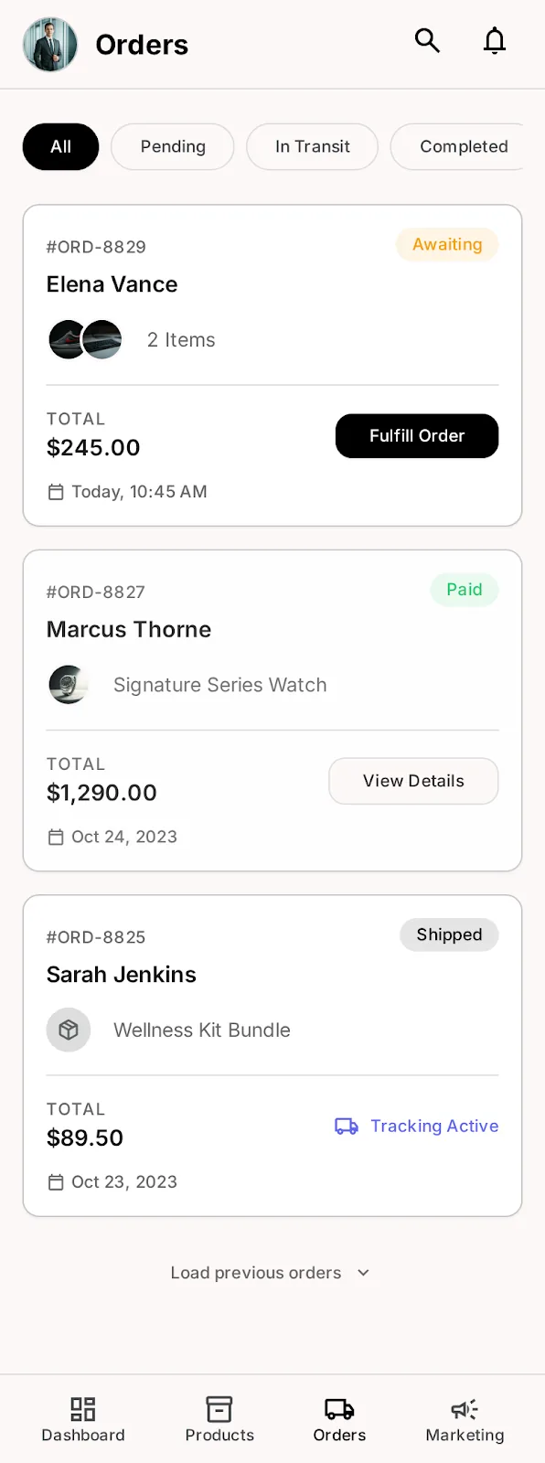
Named courier, living map, self-serve returns — tickets −41%.
Re-engage
Every save, view & return retrains the taste graph and seller foresight.
Curation beats catalog.
No one combined AI intelligence with gallery-grade presentation across both sides of the market. That white space became the thesis I pitched to leadership.
Sellers are users too.
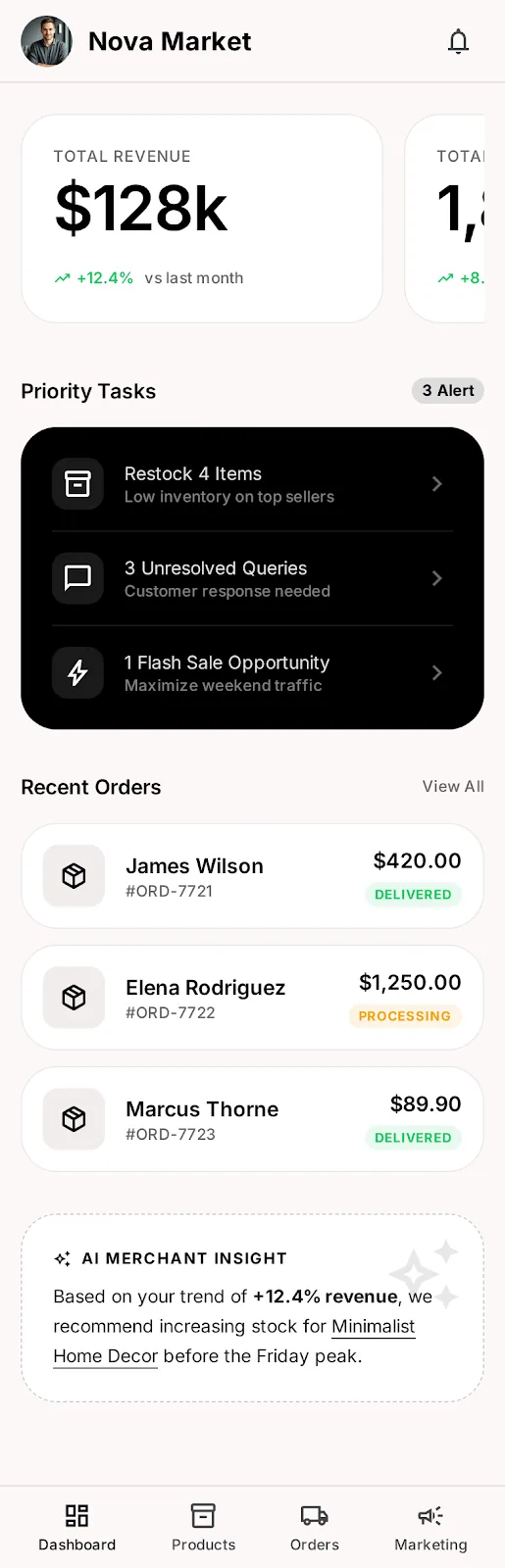
A Seller OS replaced six tools with one — turning ops tooling into the retention moat, not an afterthought.
12,400 brands · +38% conversion.
One design system shipped 130+ screens across five surfaces with zero visual drift, and cut design→dev handoff in half.
A two-sided B2B ecommerce marketplace: buyers get an AI-powered shopping app with smart product discovery and express checkout, while brands get a full seller dashboard — catalog, orders, payouts and analytics in one B2B operations suite.
Six steps. Sixteen weeks.
Led end-to-end.
I owned the process from first stakeholder interview to v2 roadmap — leading 4 designers + 1 researcher through a cadence of weekly tests and fortnightly exec reviews.
Discover
- 9 stakeholder interviews — exec, eng, support, sales
- 24 user interviews + diary studies in 3 cities
- 3,800 support tickets mined for failure patterns
- Heuristic audit of the legacy funnel
- 9 seller-shadowing days inside real boutiques
Define
- Personas & jobs-to-be-done for both market sides
- Pain-point severity matrix (segment × severity)
- North-star metric: time-to-"that's so me" + KPI tree
- Competitive positioning — found the white space
- Success criteria signed off in exec review
Ideate
- 3 co-design workshops with eng, PM, support
- Crazy-8s + storyboarding on the top 5 jobs
- 38 concepts scored on impact × effort with eng leads
- Information architecture — 5 surfaces, one nav grammar
- End-to-end user flows incl. failure & return paths
Design
- 96 tokens · 68 components · 214 variants built first
- Wireframes → hi-fi for the riskiest flows first
- 130+ screens across 5 surfaces, zero visual drift
- Motion & interaction specs for every AI moment
- Weekly critique cadence I ran across the squad
Validate
- 14 test rounds · 70 moderated sessions
- Live A/B at checkout — single sheet won (+17 pts)
- WCAG 2.1 AA audit — 0 critical issues
- UX copy testing on AI explanation patterns
- Published "what we killed & why" notes to the org
Scale & Ship
- Dev handoff specs + tokens piped to 3 eng teams
- Design QA gate on every release train
- Analytics instrumentation tied to the KPI tree
- Launch readiness reviews with support & sales
- v2 roadmap (AR try-on, social curation) pitched & funded
Two sides. One scoreboard.
Every user goal laddered to a business outcome, and every business goal to a metric I could defend in an exec review.
Own the connected journey — not a point tool. GMV via curated rec
Make supply sticky so sellers don't churn to rivals. Weekly active sellers
Lower acquisition friction with a $0 entry tier, no sales-call gate. Brands onboarded
Ship faster via one system across surfaces. Design→dev handoff time
Buyer: find the one perfect piece fast — not scroll a warehouse. Time-to-save
Buyer: trust recommendations that explain themselves. For-You CTR
Buyer: pay with certainty on four-figure orders. Checkout completion
Seller: run catalog, orders, money & team in one place. Tools replaced
B2B sellers were drowning in disconnected ecommerce tools.
Boutique merchants were drowning in disconnected tools.
Discovery was a grid. Curation was a filter.
One AI engine. Five surfaces.
Brands operate. Buyers shop.

To understand both sides of the marketplace we ran a structured discovery: 24 interviews, 1,240 survey responses, 9 seller-shadowing days and 3,800 mined support tickets. The synthesis shaped every launch decision.
◎Target Users
- The Collector — high-AOV hunters, 41% of revenue, extreme curation expectations
- The Tastemaker — trend-first, mobile-always, low brand loyalty
- The Merchant — boutique brands, 1–6 seats, ops-fatigued
⌕Research Methods
- Semi-structured interviews + diary studies across 3 cities
- Quantitative survey (n=1,240) on discovery & checkout anxiety
- Support-ticket mining + seller shadowing for workflow mapping
✦Research Goals
- Find where trust breaks on $500+ purchases
- Quantify the cost of fragmented seller tooling
- Define what "personal" must mean for AI curation to be believed
Plenty of carts.
No real B2B operating system.
| Capability | NOVA | MassMart | LuxePort | Artisanal |
|---|---|---|---|---|
| AI style-profile curation | ● | — | ◐ | — |
| Conversational shopping assistant | ● | ◐ | — | — |
| One-sheet express checkout | ● | ● | ◐ | — |
| Predictive seller analytics | ● | ◐ | — | — |
| Unified seller OS — inventory → payout | ● | ◐ | ◐ | ◐ |
| Editorial, gallery-grade presentation | ● | — | ● | ◐ |
Positioning: every player optimizes scale or curation — none combine intelligence with gallery-grade presentation. That white space became the product thesis I pitched to leadership.
What the research forced us to do.
Five findings that changed the product. Each one is paired with the move it triggered — insight is only senior when it has a consequence.
"Recommended" without a reason is noise.
Buyers distrusted any suggestion they couldn't explain — especially above $500. Personalization without transparency read as manipulation.
The grid felt like a warehouse.
Dense feeds collapsed engagement per item; collectors hunt, they don't browse. Density was killing perceived value.
Checkout anxiety spiked at step transitions.
Session recordings showed hesitation between checkout steps on high-value orders — not at the price, but at the seams.
Merchants ignored charts; they wanted orders.
62% of seller churn traced to tool overload, not fees. Dashboards full of graphs went unused while tasks piled up.
Anonymous delivery broke trust on high-value orders.
A $4,000 parcel handed to a nameless courier felt unsafe — the post-purchase gap was a brand risk, not just a logistics one.
Supply and demand were one loop, not two products.
Buyer behavior was the best demand signal sellers never had. Treating them separately left the flywheel un-powered.
Two sides of the same counter.
Mara Keller
● Pain Points
- Lives inside 6 dashboards to run one store
- No demand signal — restocks on gut feeling
- Payouts opaque; reconciliation eats Sundays
- 14 hrs/week on ops instead of product
● Goals
- One place for catalog, orders, money, team
- Know what to make more of — before the peak
- Look as premium as the products she sells
- Onboard a teammate without a training day
"I became a seller to design objects — not to live inside six dashboards."
— Merchant interview 07Elena Marsh
● Pain Points
- Endless grids feel like warehouse shopping
- Doesn't trust "recommended" without a reason
- Checkout anxiety on four-figure orders
- Anonymous couriers for $4,000 deliveries
● Goals
- Find the one perfect piece, fast
- Recommendations that explain themselves
- Pay in three taps, never re-enter a card
- Watch the parcel like a hawk — politely
"I don't browse. I hunt for the one perfect piece — and I'll pay for certainty."
— Buyer interview 03One north star.
Three principles.
North star I set for the org: time-to-"that's so me" — minutes from first open to a saved recommendation. Every KPI laddered up to it.
Quiet intelligence
AI works in the margins — insight surfaces as a whisper (one card), never a feed takeover. Trust through reasoning, not volume.
Gallery, not warehouse
One object per viewport on mobile. Monochrome chrome so products carry all the color. Density is a choice, not a default.
Sellers are users too
Every buyer-side promise must be operable by a one-person boutique in under a minute. The supply side is the retention lever.
38 features in the backlog. We shipped 4 pillars.
The buyer journey — emotion and all.
Mapping action against feeling shows exactly where trust breaks on a high-value purchase — and where one design move pays off most.
Five surfaces. One nav grammar.
130+ screens across buyer and seller, organized so every primary job is one tap from home. Depth lives only where the catalog or the books demand it.
- For You
- Style-DNA
- Collections
- Search
- Suggestions
- Filters
- Saved
- Wishlist
- Price alerts
- Bag & Checkout
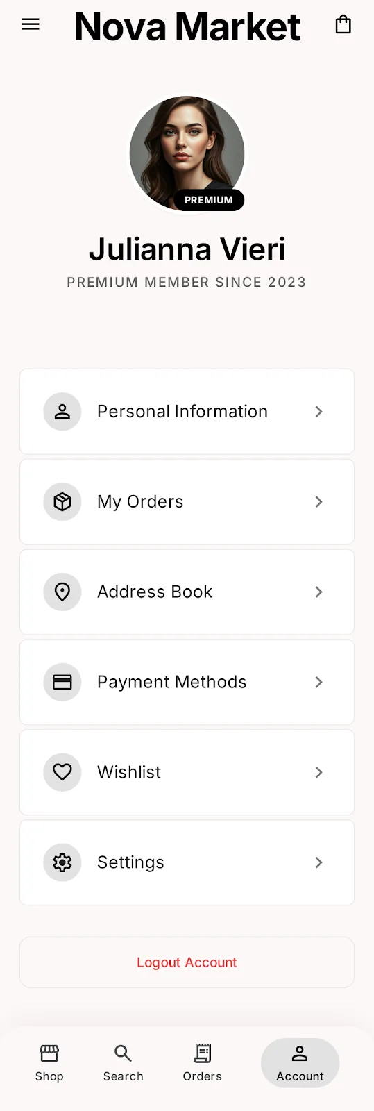
- Profile & Orders
- Home
- Priority tasks
- AI insight
- Orders
- Inventory
- Payouts
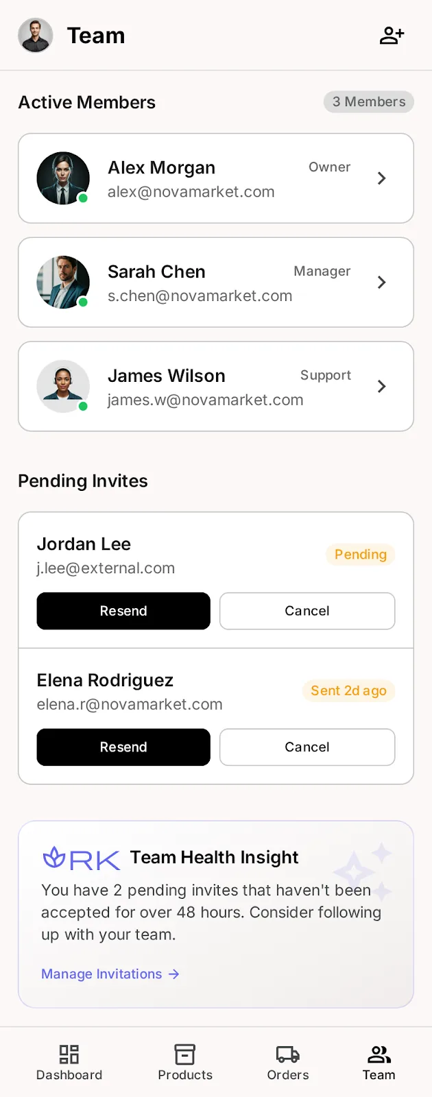
- Team & Roles
- Dashboard
- Analytics & AI
- Catalog at scale
- Finance
- Campaigns
- Acquisition landing
- Pricing ($0/$49/Custom)
- Onboarding
- Docs & API
- Home
- AI Concierge
- Brand pages
- PDP & Checkout
From first tap
to repeat purchase.
The full system: entry, discovery, conversion, post-purchase — including failure, abandonment and return paths most case studies hide. Gold = AI & decisions · dashed gold = signals training the engine · the seller loop closes the flywheel.
96 screens · demand signals
38 screens · foresight out
Information architecture: 130+ screens, 5 surfaces, one nav grammar. The flywheel is the product — every buyer action trains the engine; the engine hands sellers foresight.
14 iterations.
One breakthrough.
High-fidelity wireframes locked layout, spacing and hierarchy before a single pixel of brand was applied. The gold split shows the exact moment grayscale became gallery. The breakthrough: deleting the grid — one object per viewport.
Principles, applied with intent.
Where established laws shaped real screens — named, and used on purpose, not decoration after the fact.
Fewer choices, faster decisions
Too many options slows the decision.
Meet known patterns
Users expect your app to work like the others they know.
Big, close targets
Time to hit a target scales with size and distance.
Beauty buys trust
Polished interfaces are perceived as more usable.
Chunk the load
Working memory holds only a handful of items.
Keep under 400ms
Productivity soars when response feels instant.
The one that differs is remembered
The distinct item stands out.
Design the ending
People judge an experience by its peak and its end.
Tested weekly.
Changed publicly.
14 rounds · 70 moderated sessions · live A/B at checkout. I made iteration visible — every Friday the team published what we killed and why.
The grid had to die
14 home-feed versions tested in weekly 5-user rounds. Halving density to one object per viewport doubled engagement per item — the "gallery" was born from data, not taste.
Two sheets became one
Session recordings showed anxiety spikes at step transitions on $500+ orders. We collapsed address, payment and total into a single sheet with Apple Pay default.
Dashboards → decisions
Merchants ignored charts; they wanted orders. The seller home now leads with 3 priority tasks and one AI insight — analytics moved one tab deeper.
Designed for the bad day, not just the demo.
Ecommerce can’t degrade into a blank screen. Every failure state has a safe, human next step.
Don’t lose the cart
A declined four-figure order is high-anxiety and high-abandon.
Never an empty For You
Cold-start or niche taste can starve the feed.
Demand, captured
The one perfect piece is gone the moment they decide.
Graceful, not broken
Mobile commerce happens on the move.
Returns without a fight
A bad parcel can end the relationship.
Sellers are never in the dark
Opaque money erodes seller trust fastest.
One commerce system.
Every surface.
Title 20/28 — Body 16/24 — Label 11/16 · +18%
68 components.
214 variants. Zero drift.
ExploreSold out
Trending among contemporary galleries in Berlin — pairs with the Lumiere Void console.
Every journey,
solved on screen.
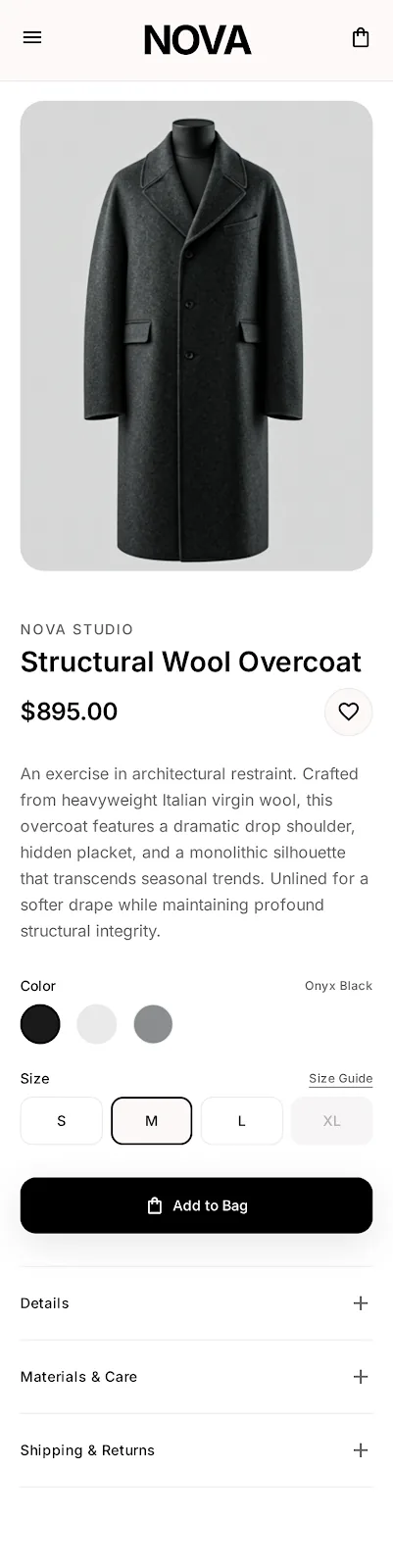
Pick interests, land on a curated storefront, and get AI ecommerce recommendations that explain themselves — each with a match % and a reason.

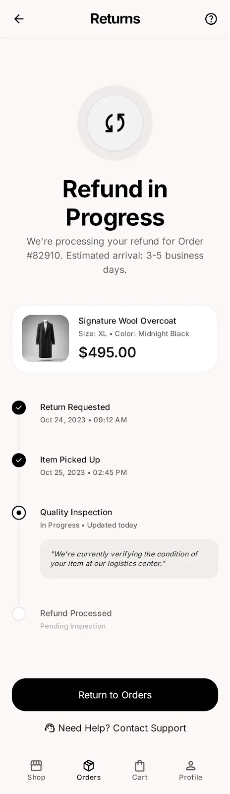
Editorial product pages flow into a one-tap express checkout — address, Apple Pay and total on a single surface. Shopping-cart completion 61% → 78%.
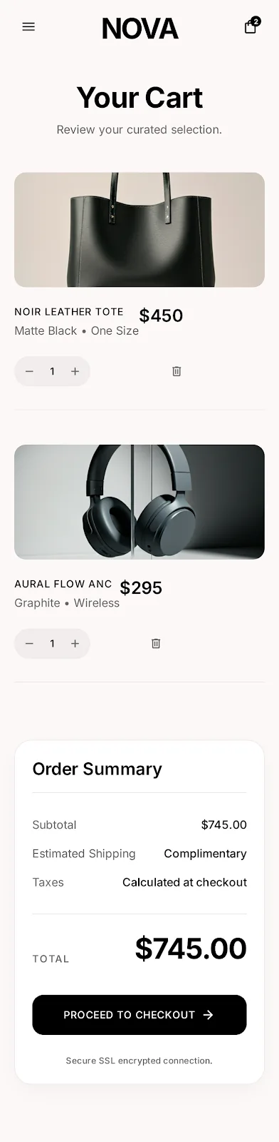
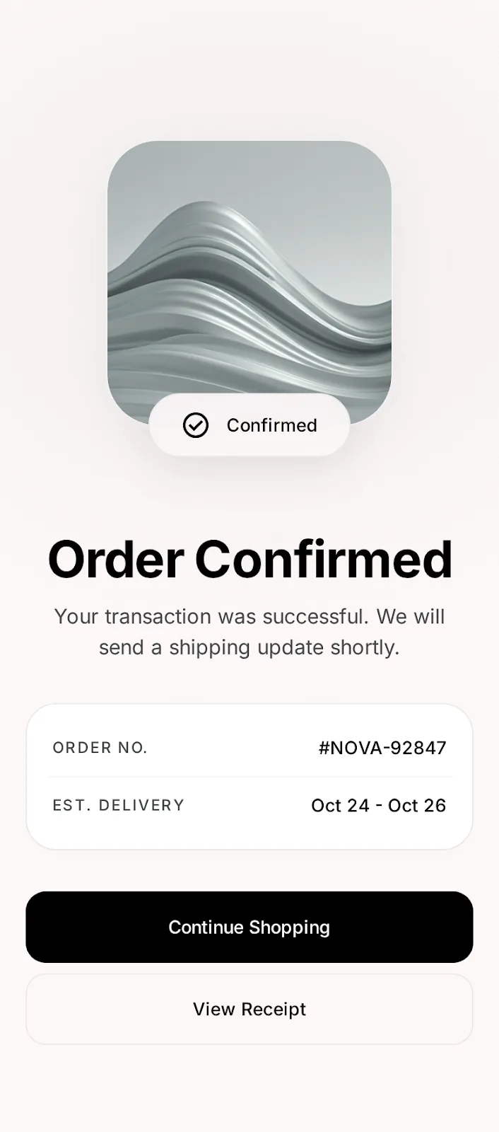
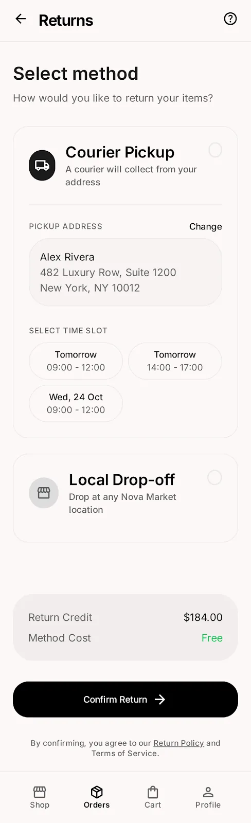
Clear order confirmation, pickup & delivery, and self-serve returns — support tickets per order fell 41%.
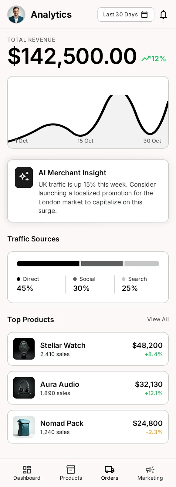
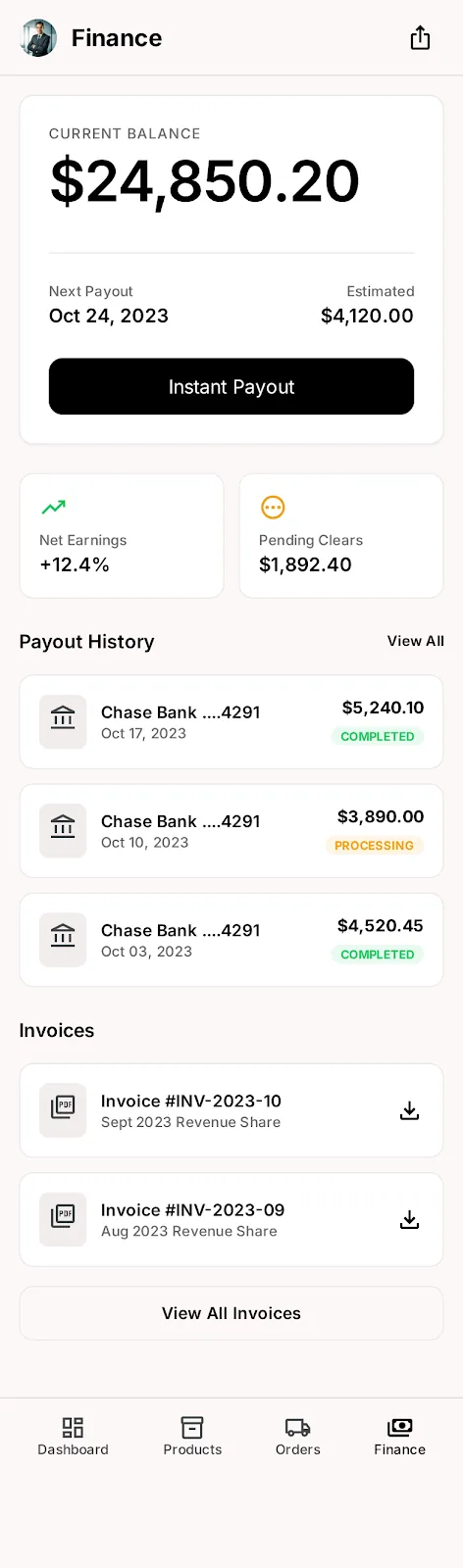
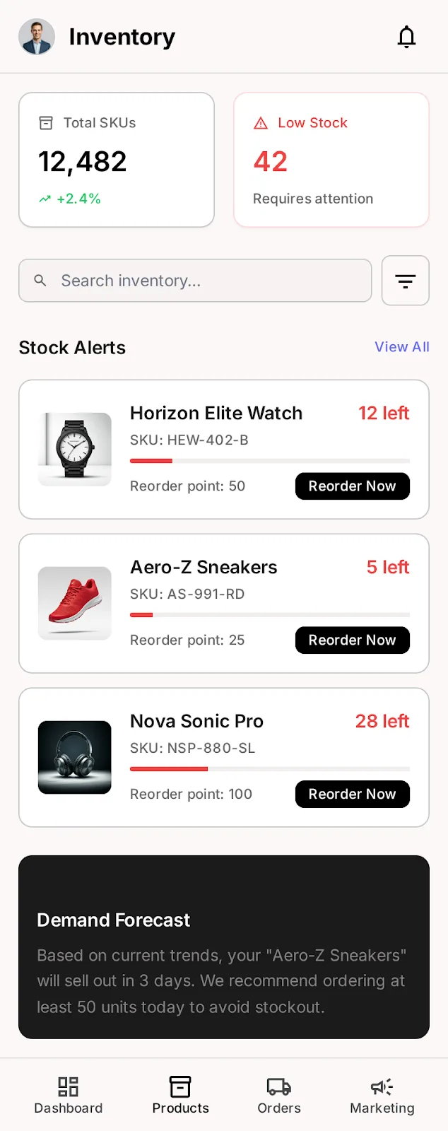
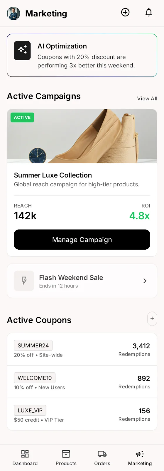
Priority tasks, AI merchant insights and visible payouts — the B2B seller dashboard in your pocket. Weekly active sellers +57% after launch.
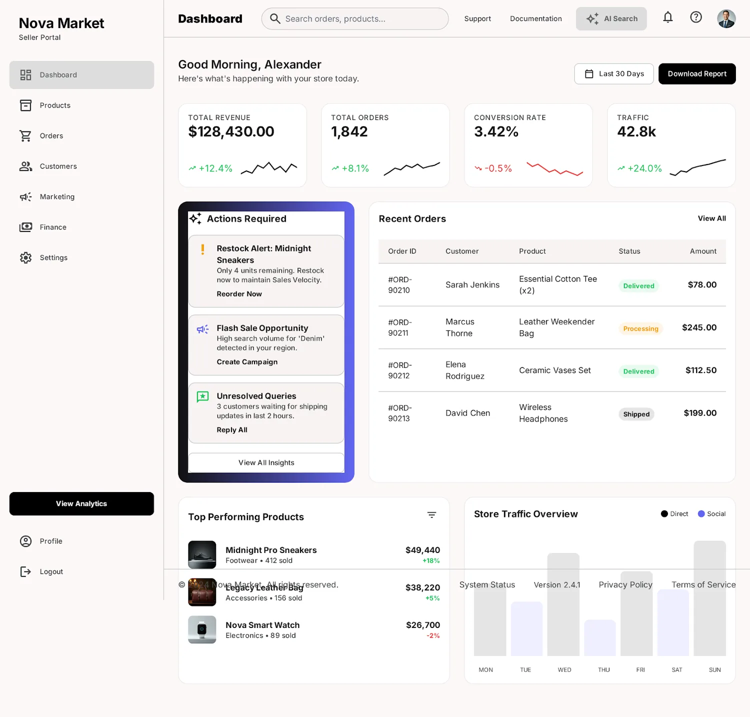
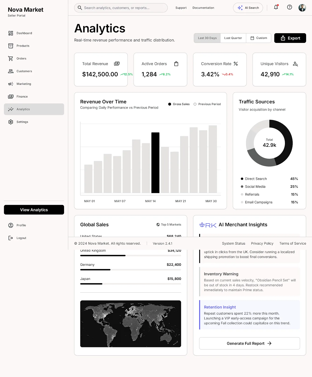
Catalog at scale, order pipelines, finance and AI insights — many ecommerce tools replaced by one B2B operations suite.
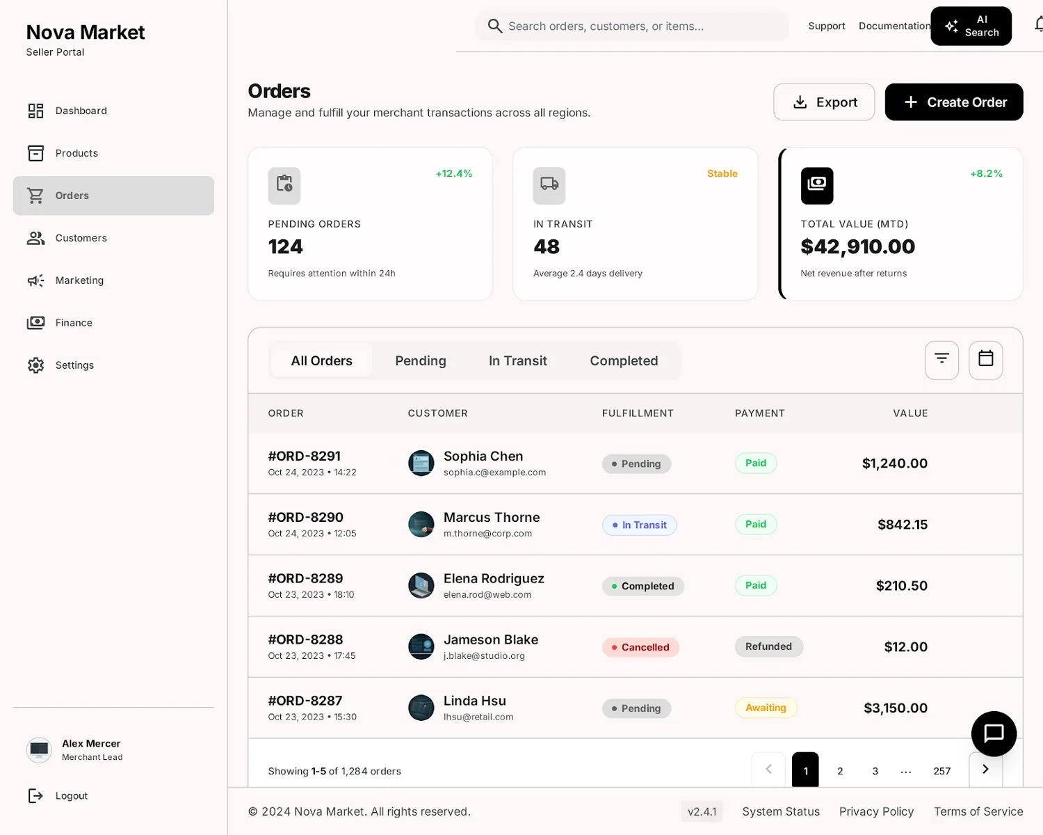
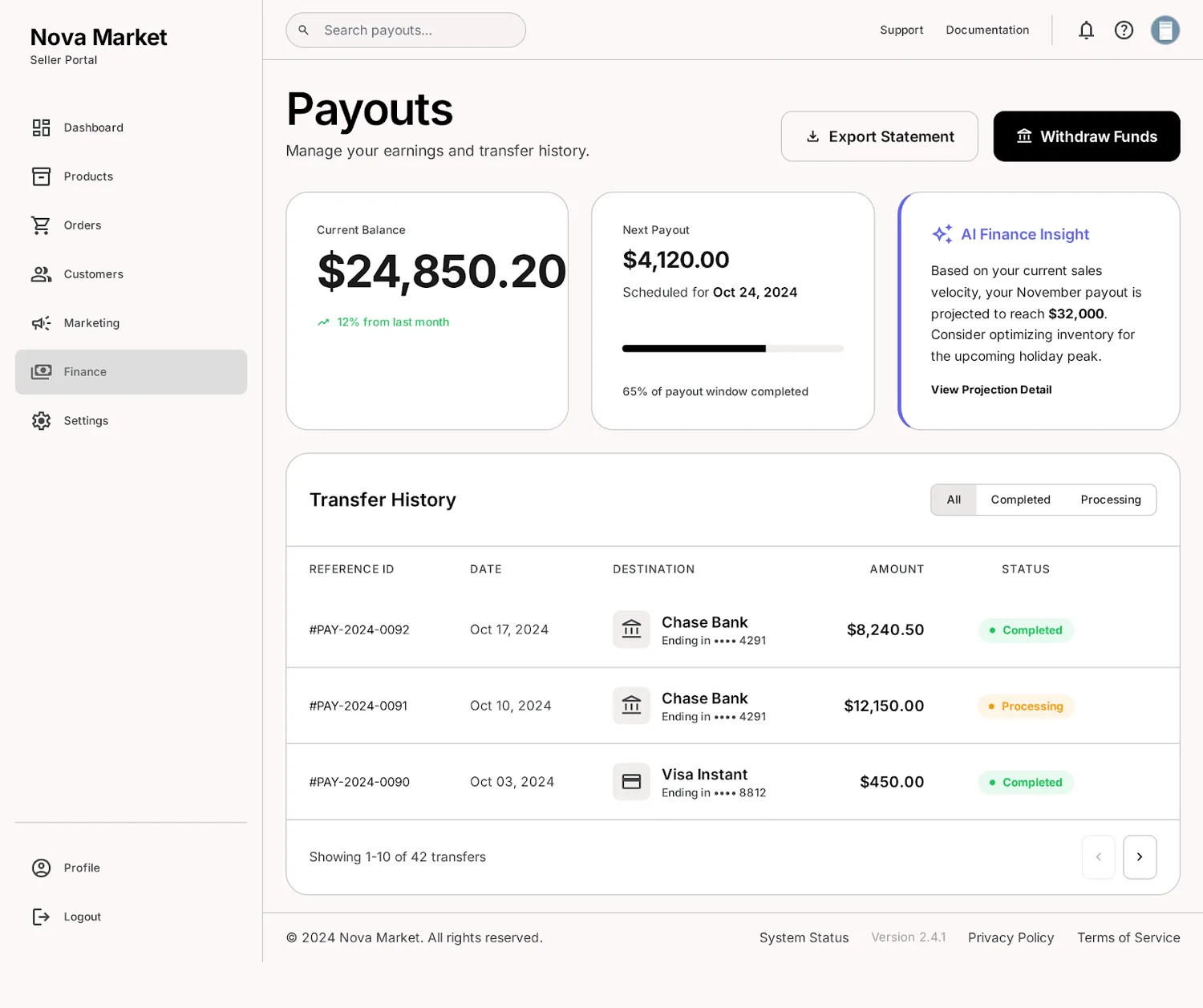
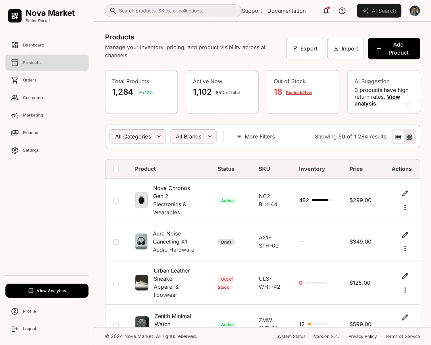
A seller-portal sign-in and a product catalog built to manage thousands of SKUs — the B2B onboarding path. 12,400 brands in 6 months. Hover to scroll.
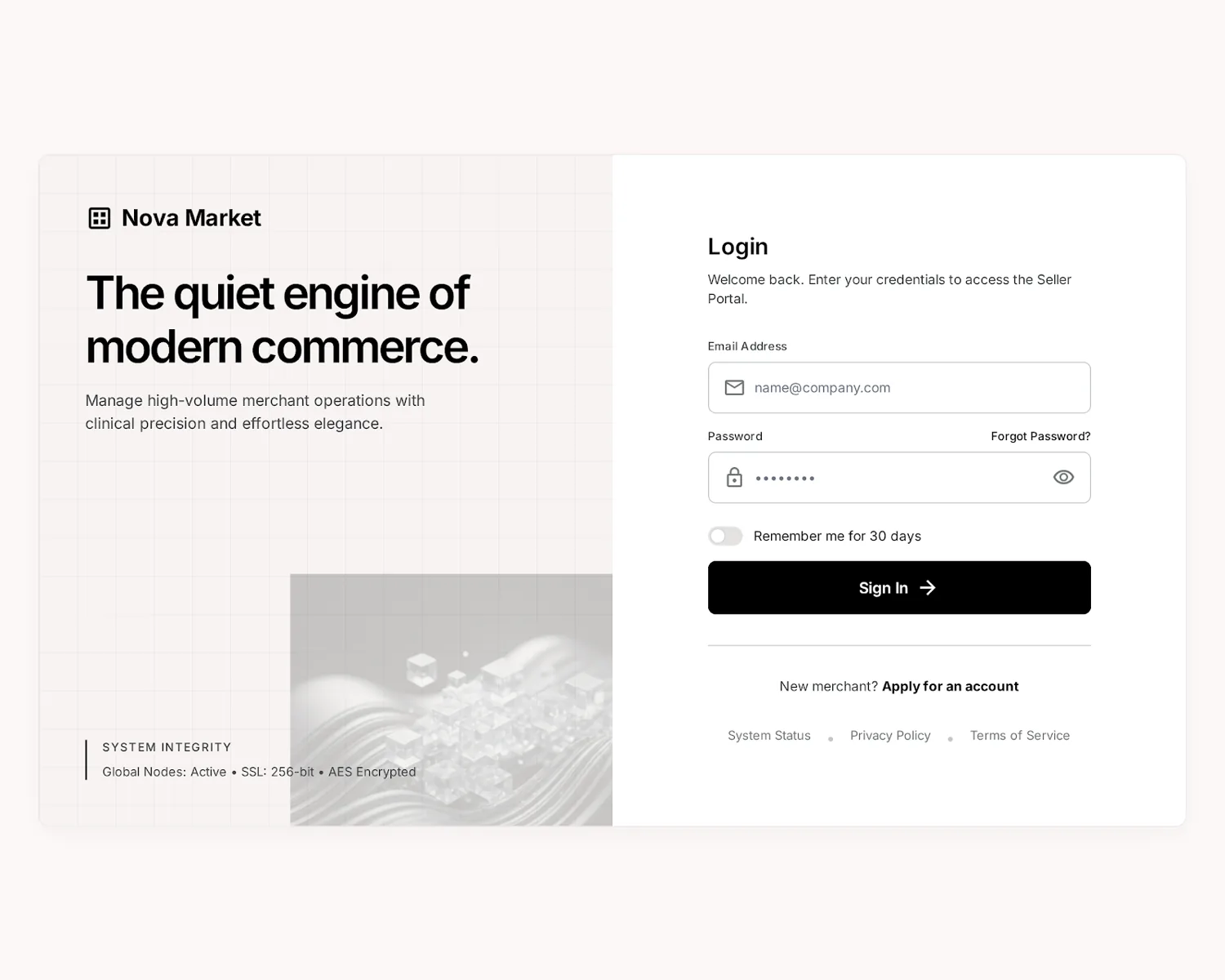
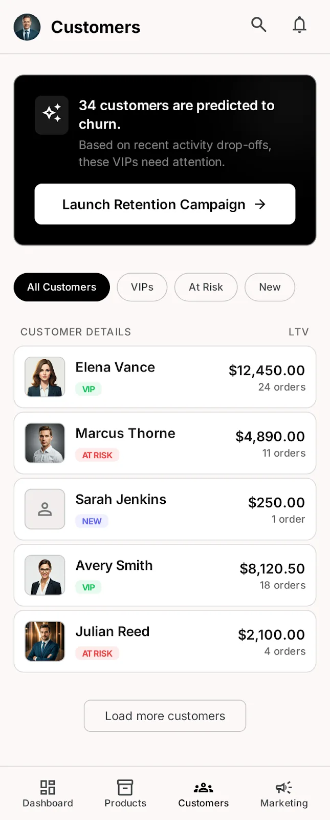
Customer insights and AI-powered return & dispute handling — the operations layer that keeps a B2B ecommerce marketplace trustworthy. Hover to scroll.
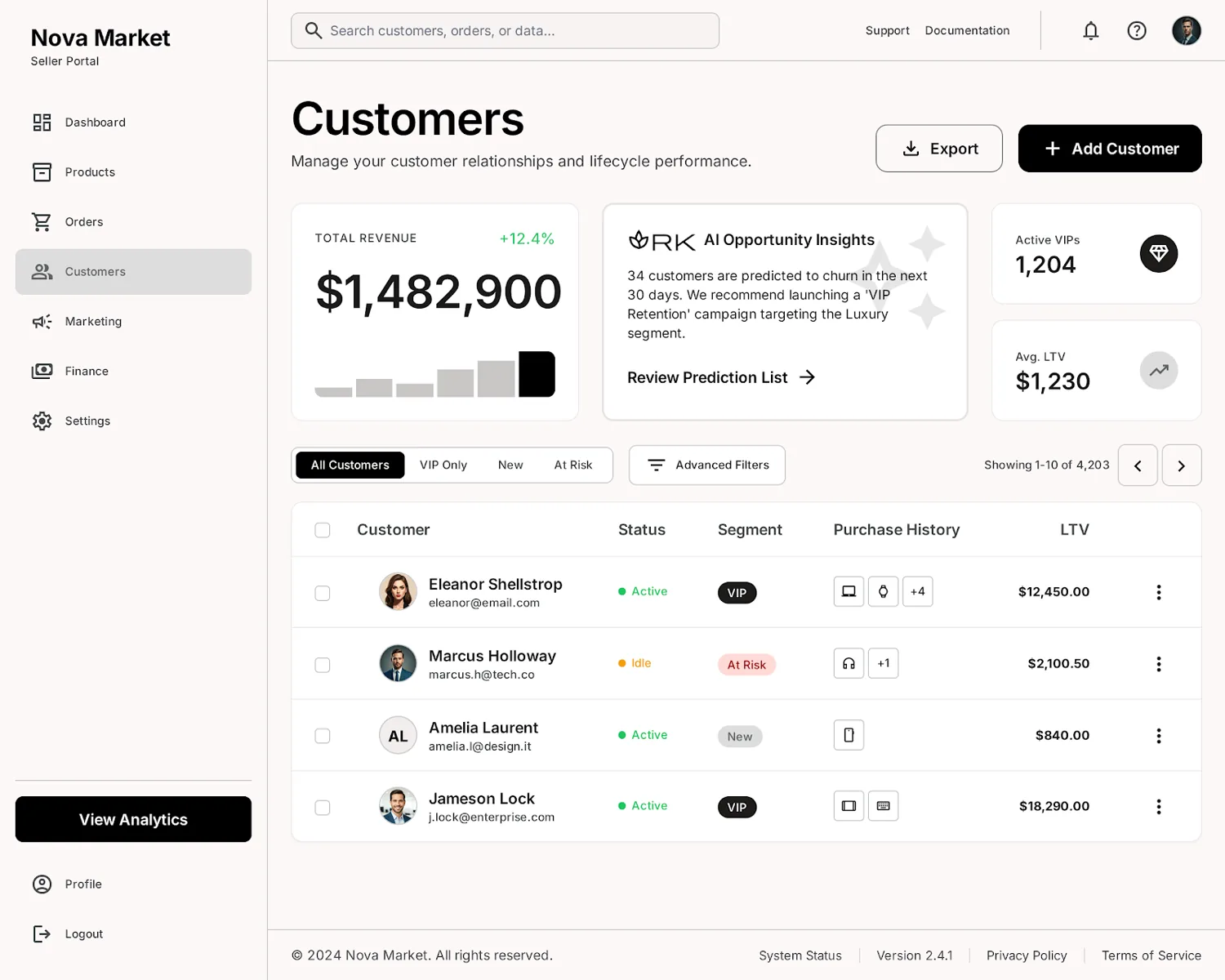
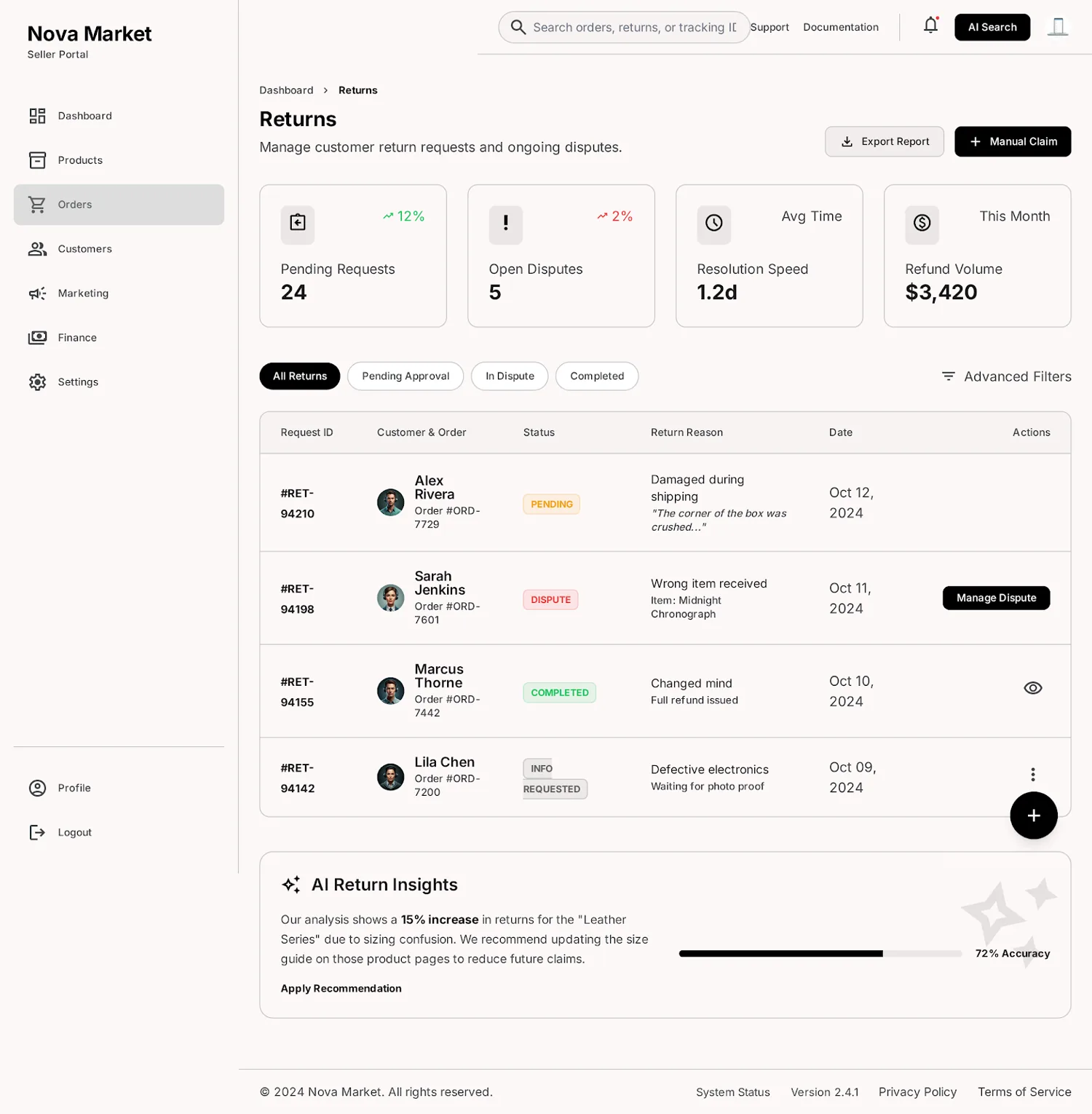
One system, every screen size.
The same tokens drive a pocket Seller OS and a desktop mission-control. Layout adapts; the grammar never does.
130+ screens.
Both sides of the market.


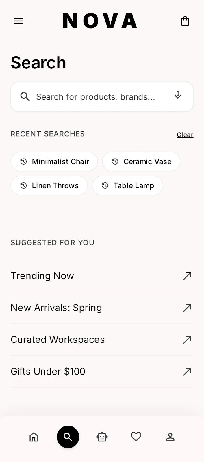
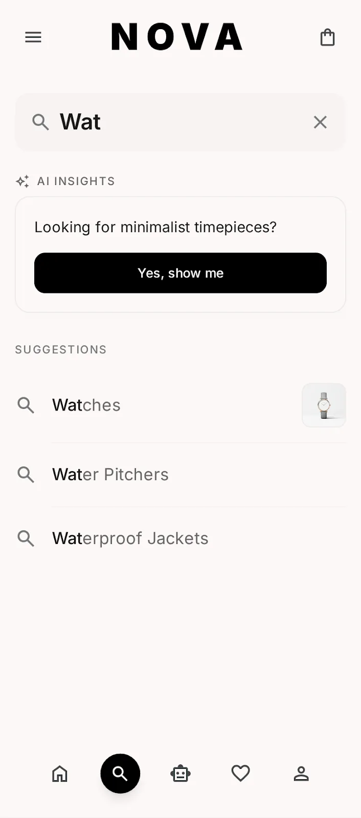
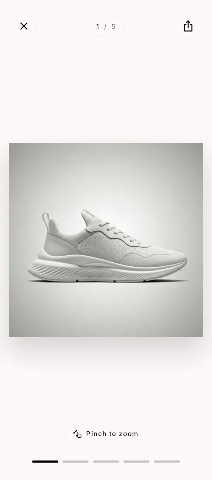
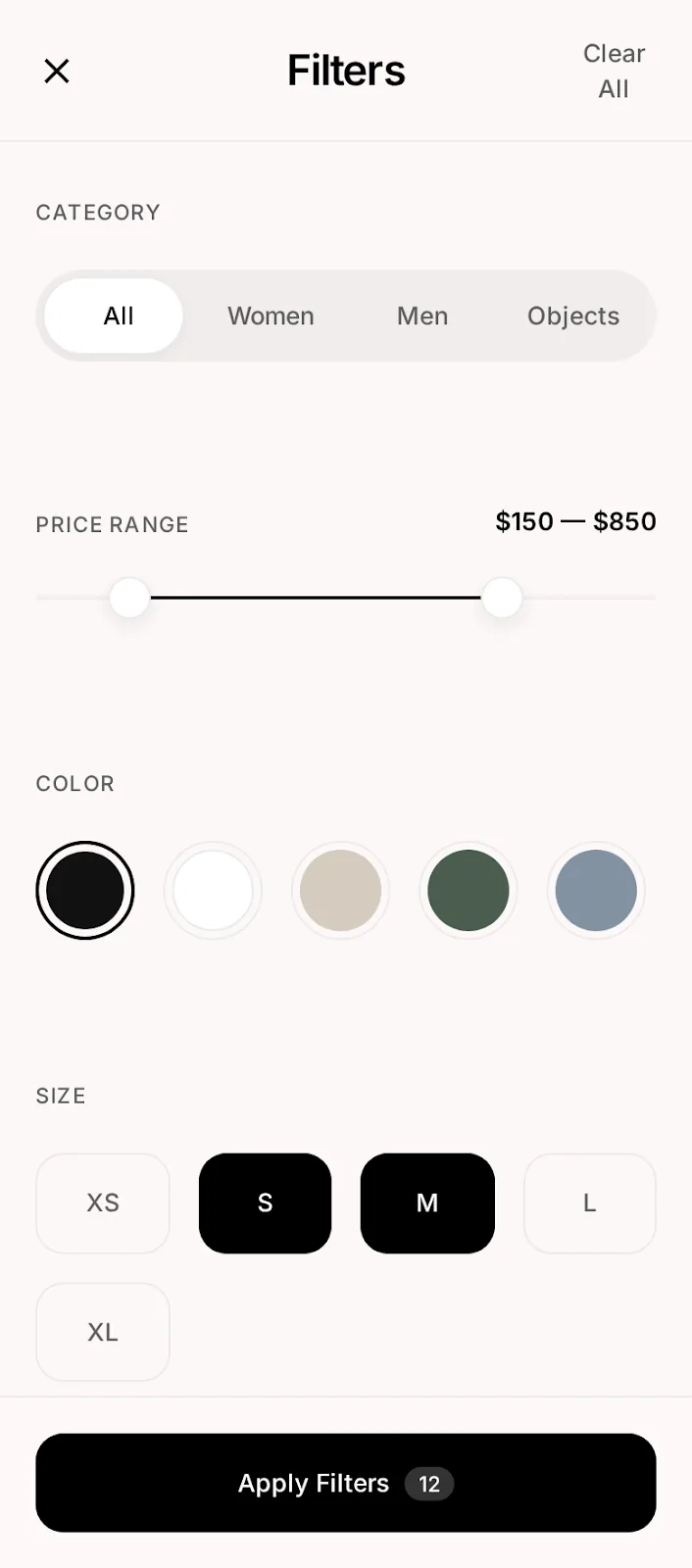

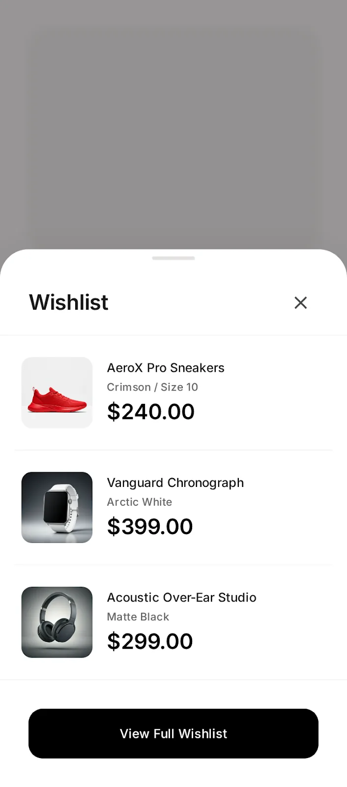
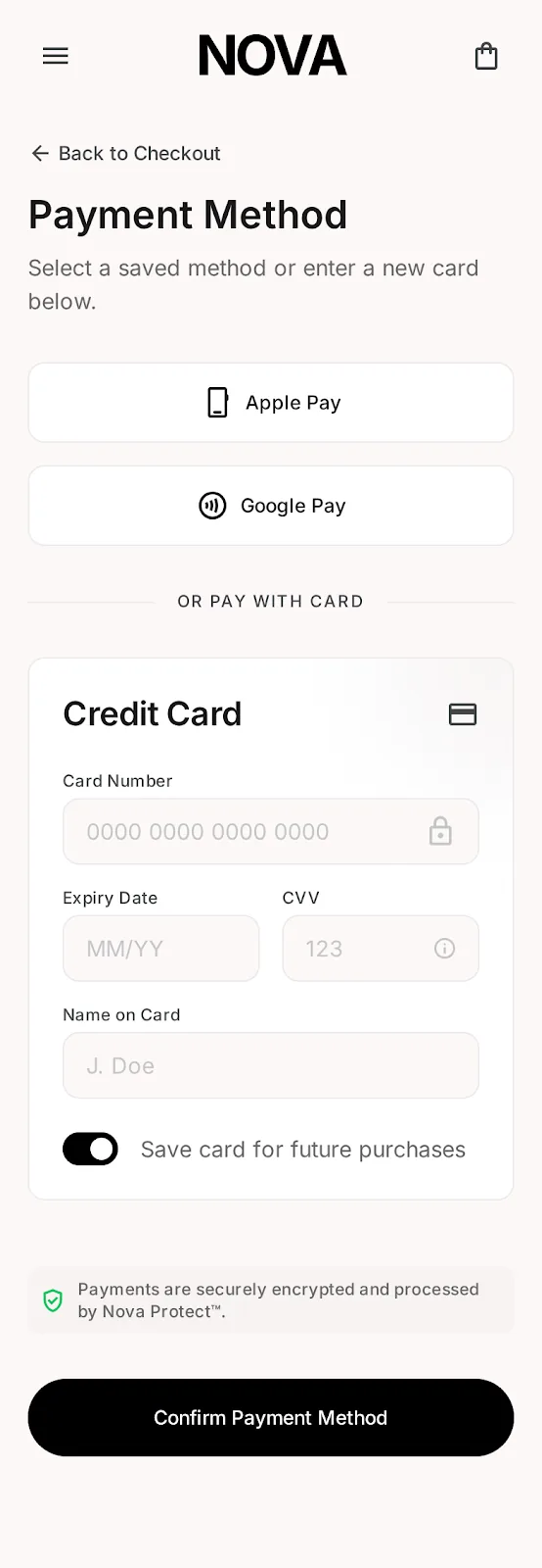
Where brands come to scale.
One design DNA across app, portal, B2B and web.
Six months later.
Illustrative of target performance.
"The design system cut our feature design-to-dev time in half. Nova's seller side is now the moat — and that came from design leadership, not a product brief."
— VP Product, Nova MarketWhat leading this
taught me.
Evidence beats taste
Every design debate ended with a test, not a title. The curated shopping feed shipped because data killed the grid — not because I outranked anyone. That norm outlived the project.
The supply side is UX
Treating merchants as first-class users turned ops tooling into the product's moat — and into my strongest business case in the boardroom.
Systems are leadership
The token system wasn't a deliverable; it was how 5 designers shipped 130+ screens with zero drift. Scale the system, not the hours.